Critique of Assertion-Evidence Research
December 14, 2012Use Red to Sway an Audience to Your Side
February 14, 2013I always recommend using a color palette when you build slides. You will get your work done faster, enjoy building slides more and the slides will look more professional. One of the best places for creating a color palette is Kuler.
After you’ve created your color palette, you’ll want to program it into PowerPoint. Let me show you how. First, here is the color palette I use.
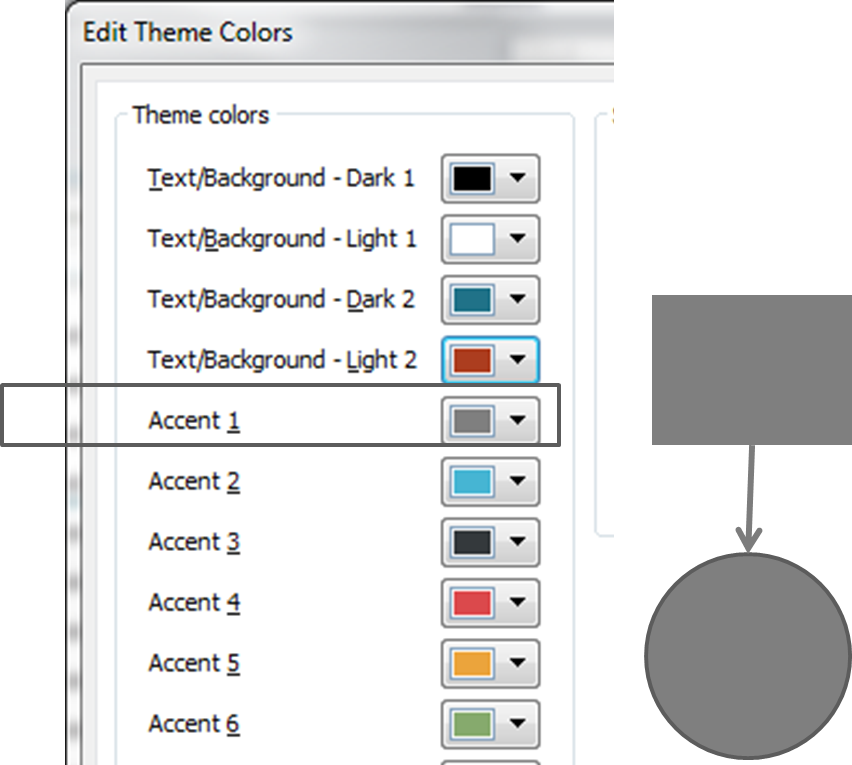
To build a custom color palette, the first thing you’ll do is go to Design > Colors > Create New Theme Colors. You’ll meet an interface that looks like this. It’s a bit confusing, so let me explain what you’re looking at.
1. Accent 1. This will be the default color when you draw lines and shapes. I recommend using gray for Accent 1, or whatever color you want your shapes to automatically contain.
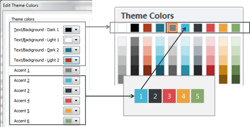
2.Accent 2-6. The 5 colors from your color palette go into Accent 2-6. If you have more than 5 colors in your color palette, you can add them as Text/Background colors (described later).
3. Hyperlinks. For hyperlink colors, choose one of your darker accent colors. For followed hyperlink, choose a lighter version of that accent color. Light colors indicate it’s been “depleted”
4. Text/Background – Dark 1 and Light 1 are your text colors. Dark1 can be black. Light1 can be white. These colors show up in the first two columns of your color menu and if you choose black and white you’ll end up with a complete range of grays in increments of 10%. Or you can choose different text colors if you prefer.
5. Text/Background – Dark 2 and Light 2 are your background colors. To be honest, these are a bit of a mystery to me since I use a white background for business slides or one of my accent colors if I need a color background. If you have more than 5 colors in your color palette, you might add them here, or just choose 2 extra colors you think you might need.
Now just name your new color theme, click “Save” and you’re done. Once your new color theme is saved, you can select it any time and your Color Picker pull-down menu will show your custom color palette, ready for use.
About the author: Bruce Gabrielle is author of Speaking PowerPoint: the New Language of Business, showing a 12-step method for creating clearer and more persuasive PowerPoint slides for boardroom presentations. Subscribe to this blog or join my LinkedIn group to get new posts sent to your inbox.


8 Comments
To clear up some of the mystery around Dark 1/Light 1 and Dark 2/Light 2…
These sets of colors are used to ensure that your slide background and text colors contrast. If you look at the Background Styles gallery(available on the Design tab and the Slide Master tab), you’ll see that all four light/dark colors and variations of them are available.
Choose Light 1 or Light 2 as your background style, and the font color will default to Dark 1. If you later switch to either of the dark background styles (or paste your slide into a deck that uses a dark background style), the body font will automatically change to the Light 1 color so that the text is still visible. Type some text in the title placeholder on the default slide and hover over the different background styles in turn to see this in action.
It’s worth mentioning that Light 1 and Dark 1 are also the default font colors for charts, tables, SmartArt diagrams, and Shape Styles. These are almost always black and white, so adding the Dark 2 and Light 2 colors just gives you a couple more built-in background style / color options.
There are indeed six accent colors, and these are also used to generate options in all the formatting galleries. Accent 1 will be the color of the first data series in charts. (Accent 2 will be second, Accent 3 will be third, and so on.) It will also be the default table heading color, and it will appear as the first color in some SmartArt diagrams. If the template will be used for charts with various sets of data, it’s best to select accent colors of similar intensity. When one color is much darker or lighter than the others, that data series will stand out and appear highlighted.
You can easily change the default color for shapes if you don’t like PowerPoint’s default formatting. To do so, format a shape to taste (including fill color, line color/weight, font formatting, etc.), then right-click and select Set as Default Shape. (You can do this for lines and textboxes as well.) Especially if you do a lot of charting, it is better to get the color theme right for charts and then, if necessary, set up default shapes manually.
These are just some general considerations to be aware of when setting up a color theme for a template. There’s more specific information and detailed steps in our book Building PowerPoint Templates, available at Que Publishing and Amazon.
Cheers,
Echo Swinford & Julie Terberg
Thanks Echo (and Julie too) for the detailed additions. Lots of things to consider as you’re choosing the colors for your color theme.
And here’s a link to Building PowerPoint Templates on Amazon.
—
Bruce Gabrielle
Great post! Very helpful. I’m reading both of your books (Speaking PowerPoint and Building PowerPoint Templates) at the same time.
Wonderful to hear, Donna. Hope they are making a difference in the way audiences react to your ideas.
—
Bruce Gabrielle
Oh, how funny! Thanks, Donna — hope they’re both proving useful.
[…] Bruce Gabrielle has put together a very simple step-by-step explanation of how to setup a theme. Tweet Posted in PowerPoint | Tagged color, powerpoint | Leave a […]
[…] Many of you have asked about how to easily create your own custom color themes in PowerPoint. I did some searching this morning and found this great article that describes the process in detail: https://speakingppt.com/2012/12/21/how-to-create-a-custom-color-palette-in-powerpoint/ […]
Hi Echo! Thanks for the great info. I’m currently in the process of creating a corporate template. All of the standard corporate colors have already been integrated Text/Background and Accent colors. I’d like to add a Secondary Color Palette in addition to the Theme and Standard colors in the drop down. Is this something that has to be programmed within the xml file?