Will the GOP tax plan be good for you? Graphs tell the story.
December 18, 2017Announcing! Storytelling with Graphs: A New Approach Beyond Data Visualization
August 27, 2018In my Storytelling with Graphs workshop, and my soon-to-be published book, I teach business professionals how to design graphs to make the story quick and clear. And text annotations are an important part of bringing that story to life.
So I was excited to see the folks over at storytellingwithdata.com are running a monthly graph challenge. And in January they challenged their readers to design an annotated line graph.
There was a lot of variety in the 88 entries and how they handled annotations. Some were more effective than others. But there is more than art to good annotations; there is also science, especially an understanding of how the visual path skims a graph to pick up information. Below, I capture the 10 rules of good text annotations.
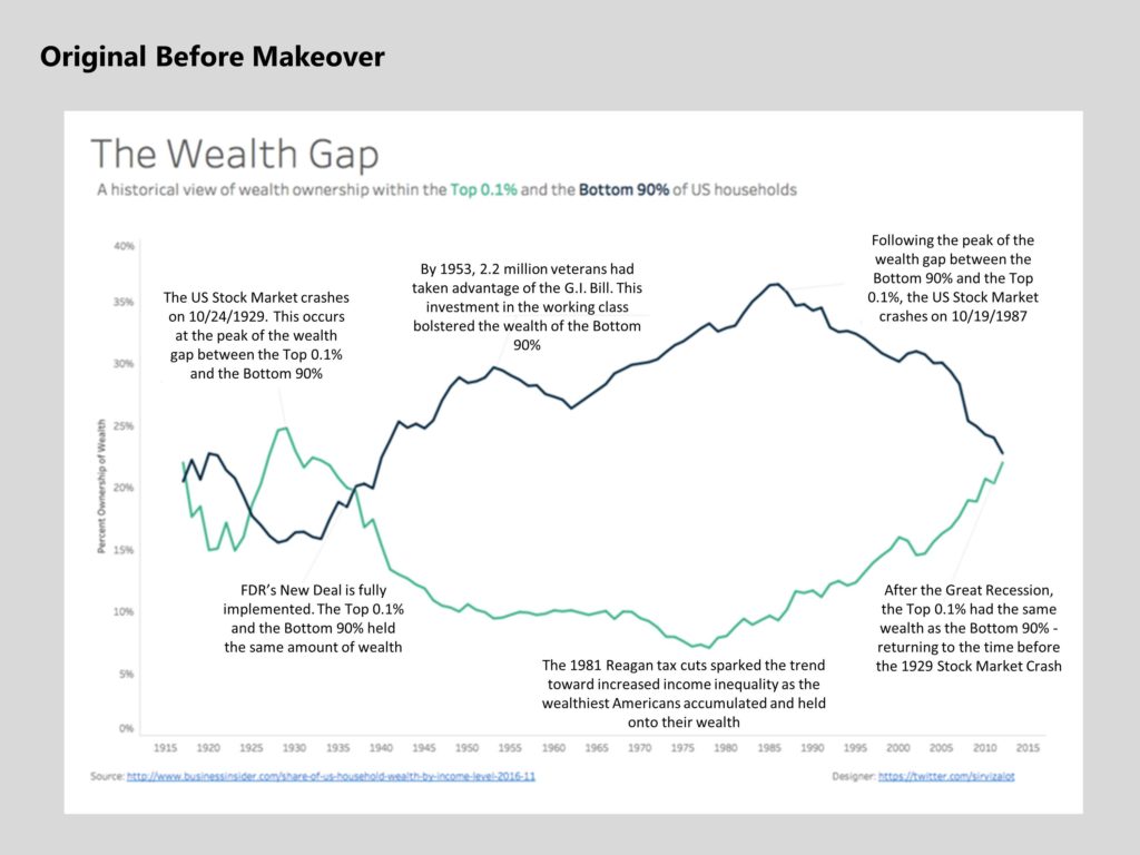
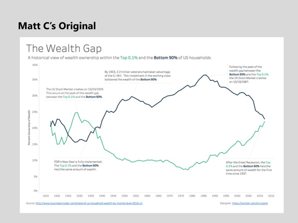
Here’s the entry from Matt Chambers (www.sirvizalot.com), modified by me to start with poor text annotations, so I can show the complete process step by step.
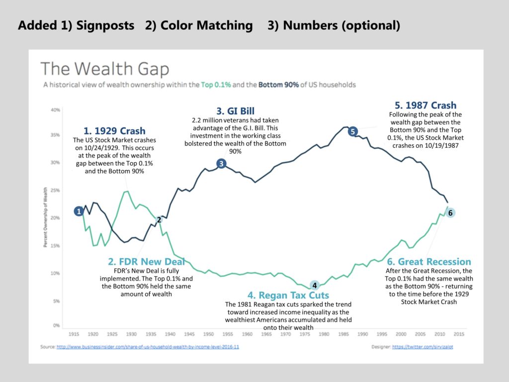
A.Signposts
Text is great. But too much text can feel overwhelming and unwelcome to read. People need to be able to skim your graph and get the message quickly. Long text annotations slow them down, so you need short text phrases (“Signposts”) so the reader can skim.
Rule#1: Signposts. All the text should not be the same size. BOLD some key phrase so the eye can quickly skim the annotations. It’s also easier to present graphs to an audience when they can match the words coming out of your mouth to the text on the graph. Use larger, bolder, more colorful font to make the signposts stand out. What’s important is CONTRAST between the signpost and the text below it.
Rule #2: Color coding. When there are multiple lines, it helps to use color to match the annotations to the lines. Colored signposts, boxes and lines make it faster for the reader to match the text with the correct line.
Rule #3: Numbers CAN be used as signposts. When there are a lot of text boxes and they start crowding each other, or it’s not practical to use connecting lines, you can use numbers to match the data point to the signpost. Numbers also make it easy to present to an audience (eg. “data point #1…”).
Here’s the updated graph with added signposts, color-coded to the lines they match, and with numbers (optional) for demonstration purposes only. We won’t continue with the numbers as we move forward.
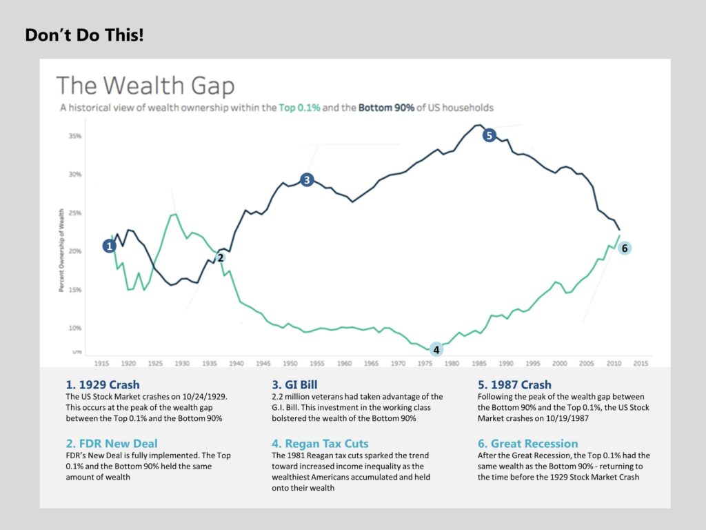
Note, we want to keep the annotations close to the graph, even if they’re numbered. We don’t want to put the annotations off to the side or else the reader is constantly switching back and forth between the annotations and the data which breaks up the flow of the story. Only do this to call out side points that aren’t critical to the overall story.
B. Text
Graphs are complicated enough before you start adding text blocks. So you need to make the annotations as unobtrusive as possible.
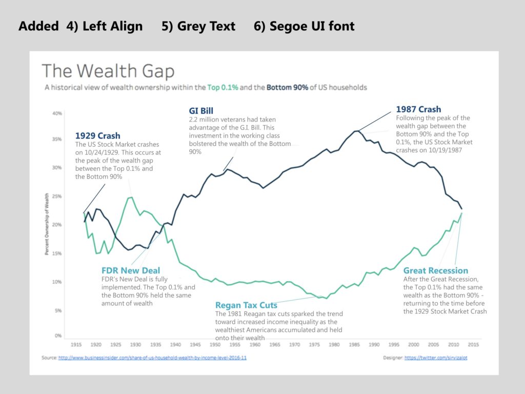
Rule #4: Left-align your text. Don’t center your text. The eye naturally wants to read left to right so left-aligned is easier to find the beginning of each line and so easier to read.
Rule #5: Grey tightly-spaced text. Use grey text for the annotation, to have more contrast with the signpost. Graphs are complicated enough. Using grey text makes it as unobtrusive as possible. And use a tighter line spacing than the default in PowerPoint, which will take up more space and clutter up your graph. For 10pt font, use 11pt line spacing.
Rule #6: Font. While we’re on the topic, avoid the default Calibri font. It makes your graphs look like everyone else’s. Instead, choose a different font that gives your graph more personality (see this blog post). Research says sans serif fonts are friendlier and serif fonts are more formal. Both are equally readable.
Here’s the graph with left-aligned grey text, using a different font (Segoe UI).
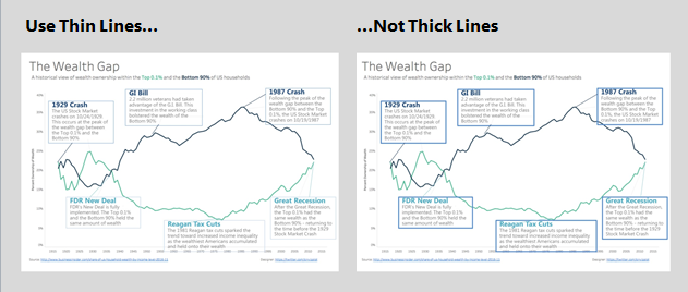
Rule #7: Go light on the boxes and line colors. Boxes are okay but go light here, using thin lightly colored lines. Again, graphs are complicated enough and get even more complicated when you start adding text annotations. Same with the connecting lines. Go light here or even use dotted lines.
C. Placement
You can’t just slap a bunch of text boxes onto a graph wherever they will fit. The eye needs to be able to GLIDE through a graph, not be jerked around by random placement. So placement can assist in quickly skimming your graph.
Rule #8: Close to the data. Make the annotation very near the data point, not far away. That blank space between the text and the data point is called “trapped whitespace” and the eye has to flick back and forth to match the text and data point, creating more work for the reader. Minimize that trapped whitespace.
Rule #9: Left to right, top to bottom. The eye naturally moves left to right, top to bottom, so it’s a more natural reading path for the annotation to be placed along that path. Wherever it’s practical, place your annotations above and to the left of the data point, or at least slope your lines that direction. Annotations centered directly above a data point require a straight up and down eye sweep which is unpleasant for the reader.
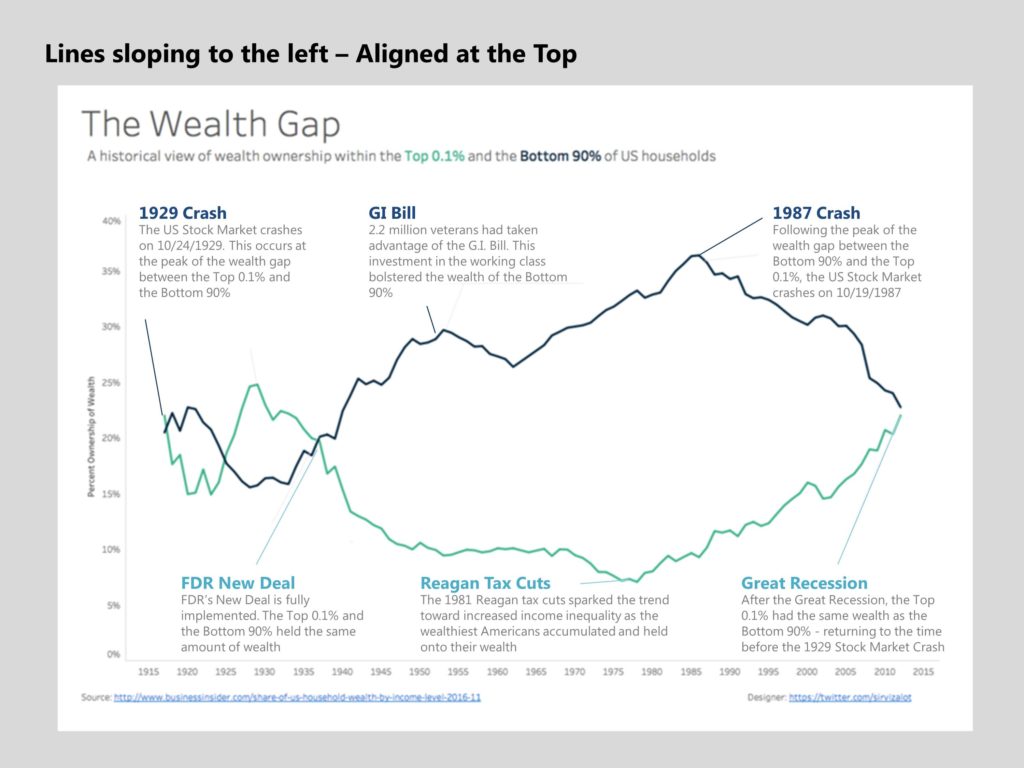
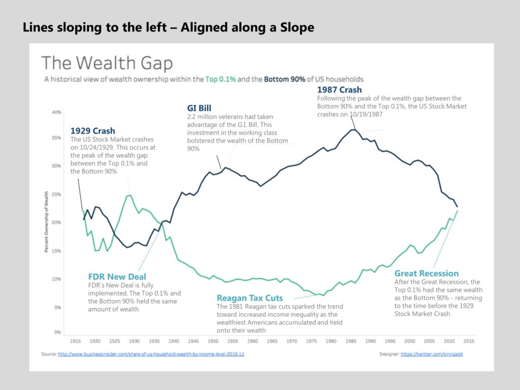
Rule #10: Alignment. To improve the look of your graphs, and avoid a cluttered and jittery look that makes it more challenging to read, pay attention to alignment. Line the signposts as much as possible along the top and bottom. Or, align them along a smooth slope. You can also reinforce the idea of something rising or falling by aligning your text boxes along an upward or downward sloping path.
Here’s our final graph with the annotations aligned at the top and bottom and the connecting lines sloping to the left. This looks neat but there’s more trapped whitespace in places and there’s no slope to the annotations reinforcing the idea of increase/decrease.
And here’s that same graph with the annotations aligned along a slope, to reinforce the idea of rising and falling inequality. We’ve lost the tidy look of the last graph but that’s the tradeoff when you move the annotations closer to the data.
And as a reminder, here’s where we started…
I’d like to thank Matt Chambers (www.sirvizalot.com) for permission to use his underlying graph and annotations for this exercise. Here’s Matt’s original entry.
I also want to invite you to revisit the January challenge and check out the 88 entries. You’ll find the graphs that follow these 10 Rules tend to not only be faster to understand but they are more attractive to look at as well.
If you like these tips, you’ll love my soon-to-be-published book Storytelling with Graphs. Subscribe to my blog to receive an email when it’s available for purchase.

2 Comments
One thing you didn’t address that I’d be interested in knowing: If you use dates in some annotations, should you be consistent in doing that? Two of the call-outs have a year and others don’t, which seems to make the reader try to “add in” or try to calculate what the other years may be. It also seems that being consistent w/adding years would help to tell the overall timeframe of the graph better.
Hi Jeannine – Yes, I agree that adding the years would add that consistency and in my original sketches I did include the years. The years also make it easier to present to an audience (e.g., “In 1981…”) and everyone will know where to look.
In this case, I was referring to 2 specific market crashes with specific years associated with them. Some of the other annotated events did not occur in a specific year, which is why I decided against adding the years. But I think that was more of a judgement call, and I could be talked into changing my mind on that.
—
Bruce Gabrielle