Why Tufte is Flat-Out Wrong about Pie Charts
March 18, 2013Slide Makeover in 6 Steps: NSA Slide
June 10, 2013What does it mean to tell stories with graphs? That’s a complicated question and one I plan to answer fully in my new book, called “Storytelling with Graphs”, due out this summer.
Storytelling with graphs means many things. At a minimum, it means finding the meaning in the data and why it’s relevant to the audience.
But storytelling is more than just finding the meaning, and in this blog post I want to give you an example of taking a graph and turning it into a story.
1. First, the data
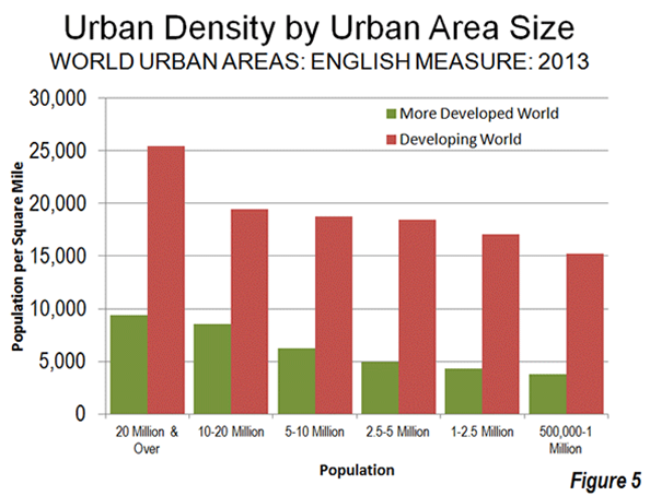
We start with the raw data. In this case, I found a graph showing the population density by city size in both developed and developing countries. What’s the story?
2. Next, the meaning
Likely, you can’t see the story. That’s because data is dead. It’s just numbers. In order for it to come alive, it has to have some meaning to the audience. And especially, meaning that leads to an emotional reaction. What’s the meaning in this data?
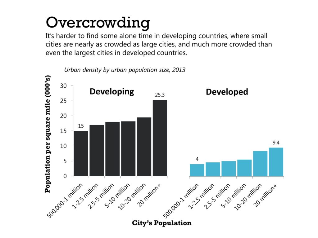
Well, we see that cities are more densely packed in developing countries than developed countries. And even the smallest city in a developing nation is more crowded than the largest cities in a developed nation.
So we might focus on the problem of over-crowding in developing countries. To bring out the meaning, we need to
- Write the conclusion as the graph title
- Use a graph that clearly demonstrates the comparison between developing and developed countries. I might suggest two column charts next to each other. We aren’t trying to highlight the difference by city size, but the overall difference between countries
- Finally, we choose colors that have meaning. The original graph uses red and green, which are both Christmas colors and suggest negative and positive values. I’m going to instead use a sooty gray for the developing countries, to suggest the filth associated with crowded living conditions, and a bright blue for developed countries to convey a sense of cleanliness and oppenness.

3. Finally, the storytelling.
How do you feel now? Likely, you still don’t really feel anything but at least you are starting to focus on the idea the graph is talking about an important topic: over-crowding.
Now it has meaning, but it’s still just data. Abstract blobs of…something! Storytelling is a complex topic, but at the risk of over-simplifying, the foundation of storytelling is turning the abstract concrete.
Graphs are abstract: just colored shapes showing rising and falling, more and less. Stories are concrete: people, places, things!
What are we really saying in this graph and — most importantly — what does it LOOK like? We’re talking about overcrowding in cities in developing countries like India, China and Pakistan. We can find many pictures online showing what overcrowding looks like.
For instance, if you want to start a discussion about over-crowded cities in developing countries, you could start your presentation by showing the audience this picture. Ask them: what do you see here? (Image (c) McKay Savage)
This is a bus in India, leaning to the side because its shock absorbers are damaged on that side. It’s common to see buses like this in India, leaning awkwardly. Can you imagine how uncomfortable it is to ride on a bus like this for one hour? Leaning to the side, with no shock absorbers?
What causes this? You’ll be stunned to see that some cities in India are so crowded, people cannot even fit onto the buses and trains. What do they do? Watch this video.
That’s right, they are hanging onto the outside! Day after day, the cities are so crowded the public transport system cannot fit them onto its seats. So men and women risk their lives and hang onto the outside of trains and buses. Constant weight on one side of the bus damages the shock absorbers and creates a permanent tilt to the buses. Even the trains are over-crowded, as seen in the terrifying video below.
Here’s a graph showing that the living conditions in even in the smallest cities in countries like India, China and Pakistan are more crowded than they are in the largest American cities! 
Overcrowding is a serious problem. It can lead to housing shortages, slums, traffic congestion, unsanitary living conditions, health problems, unemployment, crime, pollution, social tension and other problems. What can we do to alleviate these problems in developing countries? (Image (c) jolseyshowaa)
Summary
How do you feel now? Likely, the images and videos are making you feel shock or despair or even amusement. More than the graph did.
Graphs are great at visualizing data and identifying patterns that suggest interesting stories. But graphs are not stories. Stories are concrete and have people, places and things. So, use graphs to identify the stories. But don’t let graphs tell the story. Use them to support the telling of the story.
Storytelling is more than making the abstract concrete. It also involves a sequence of events with a narrative arc, a hero who faces conflict and other things. But start by making the abstract concrete and you are on the path toward storytelling with graphs.
Pick up my new book, “Storytelling with Graphs”, when it becomes available this summer. Subscribe to this blog to be alerted when it’s available.
About the author: Bruce Gabrielle is author of Speaking PowerPoint: the New Language of Business, showing a 12-step method for creating clearer and more persuasive PowerPoint slides for boardroom presentations. Subscribe to this blog or join my LinkedIn group to get new posts sent to your inbox.


1 Comment
Hi Bruce, just found your site, and I love this article: cleanly written and easy to implement. I especiallly liked “data is dead”. Thanks! Sarah