Great Stories Have Contrast, Not Conflict
September 3, 2013Top 5 Examples of Storytelling with Graphs
September 29, 2013I’m always interested in new ways to visualize data, so I was thrilled to discover a method for visualizing tables, which I call a “cobblestone table”.
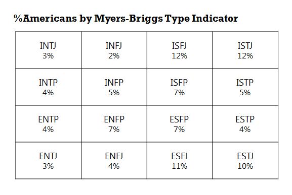
Imagine you have this table showing percentage of Americans with a certain Myers Briggs personality type (I’m a very rare INTJ). It’s hard to see any patterns in this table because each cell is the same size and shape.
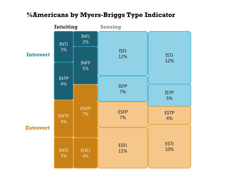
But we can draw more inferences if we convert each cell into a different sized shape based on its value, like this.
Now a lot of insights start jumping out
- There are roughly an equal number of introverts and extroverts
- There are about twice as many sensing types as intuiting types
- Sensing types are also more likely to be judging types (the “J” at the end of the 4-letter type)
I have no idea what this table is called, even after researching it extensively. For now, I’m calling it a cobblestone table because of its similarity to cobblestone paths. But if you know its proper name, please leave a comment below.
Cobblestone tables are complex to make. You will have to use the table tool in PowerPoint to size each column, then create separate shapes and resize them accurately. You’ll also have to use the alignment tools to get them lined up neatly. But they are a great visualization tool for exploring or explaining the data.
I’ll be talking about cobblestone tables, as well as a lot of other types of graphs, in my new book “Storytelling with Graphs”, which I hope to have available in the next month or so. If you’d like to be alerted when it’s available, please subscribe to this blog or join my LinkedIn group.
About the author: Bruce Gabrielle is author of Speaking PowerPoint: the New Language of Business, showing a 12-step method for creating clearer and more persuasive PowerPoint slides for boardroom presentations. Subscribe to this blog or join my LinkedIn group to get new posts sent to your inbox.


7 Comments
Hi Bruce,
I love the name and the design of this example, but this is essentially a tree map. (http://en.wikipedia.org/wiki/Tree_map). Hope that’s not a disappointment!
I love using tree maps in presentation because they are so visual. You can make them with Tableau, but there are a few free online resources for creating them. I usually use ManyEyes.com, take a screenshot of the tree map, bring it into PPT and then just visually match PPT shapes on top of it.
I’ve written a bit about them on my site.
Can’t wait for the new book!
– Nolan
Thanks Nolan. Yes, I see how it could be a treemap or even a marimekko chart or a version of a sieve diagram. In any case, it’s some kind of mosaic display.
Upon further reflection, this is the wrong table to use. A cross-tabulation would be a better example.
Thanks for the manyeyes tip. I tend to agonize over the exact shape dimensions so maybe I’ll give that a try next time.
—
Bruce
This tool from Dave Paradi might assist with calculating the dimensions. http://www.thinkoutsidetheslide.com/proportional-shape-comparison-diagram-calculation-tool/
Thanks for sharing that resource Jackie. I just use Excel to calculate the exact values. But I’ll give Dave’s site a try.
—
Bruce
Wow, what a before/after example! Thank you for sharing this, and Jackie, thank you for sharing Dave Paradi’s tool. I’ll definitely try it.
Bruce, I’m eagerly waiting for your new book. Congratulations.
I learned about Treemaps from Nolan at the Presentation Summit last week and created a tool that will help calculate the sizes for all the rectangles based on inputs of the total size of the area and the values you want to represent. You can check it out at http://www.SimpleTreemapCalculator.com.
That’s really cool Dave. Thanks for building that.