Could Donald Trump Ever Be President? Graphs Tell the Story.
August 26, 2015Will Trump Win GOP Primary Race? Graphs Tell the Story.
February 8, 2016I just learned about #MakeoverMonday, an informal challenge and fun weekly event run by Andy Kriebel and Andy Cotgreave, where people do a graph makeover. This week, they asked, how can we improve this graph (raw data here)? As an educational opportunity, here’s how I approach it.

1.Crossing lines
First, we have to be careful about letting lines cross on a dual-axis line graph. Research finds it’s more difficult to understand line graphs when the lines cross over.
The other problem is that when lines cross, it sends an unintended message that something has shifted. Something that used to be larger is now smaller. That’s not what we’re saying, and yet there is that subtle message out there. And in fact, there is no reason the lines have to cross. Think about it. They are only crossing because of the arbitrary choice of scales. We can change the crossover point by changing the scale.
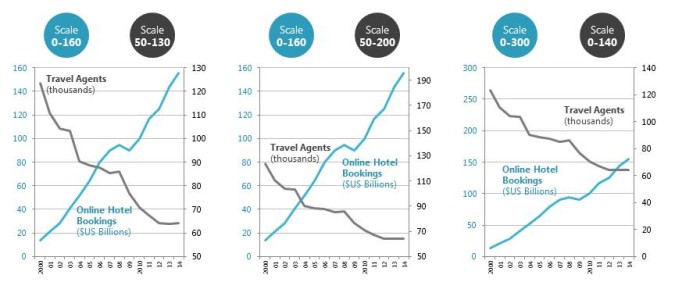
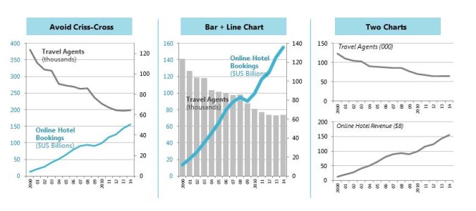
So, generally avoid having lines that criss-cross like this. Instead, change the scale so the lines never criss-cross, or use a combination bar/line graph, or use two different graphs.
2. Graph title
Whatever point you are trying to make, write it out as the graph title. Right now, the graph title tells you what data is being measured, but not what conclusions you should draw. When you leave the point unstated, people may not get it, or may get the wrong idea. So spell it out clearly.
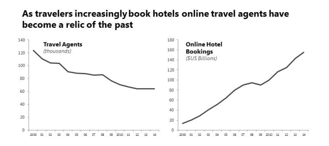
3. Cause and Effect
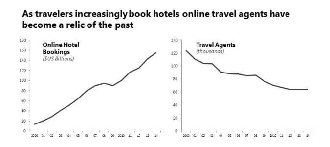
I’m going to use two different graphs. Which one comes first? If you are making a cause-effect statement, as we are, put the cause first and the effect second.
4. Graph choice
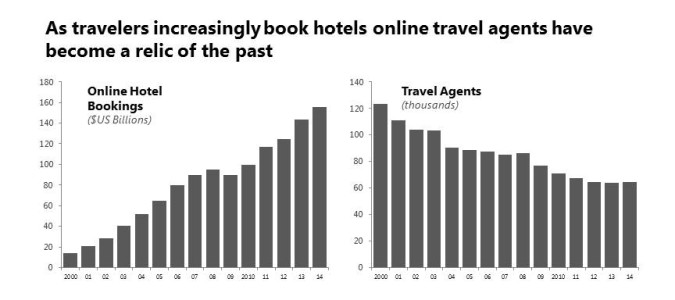
Now, I could use a line graph because nothing says TREND like a line graph. But I’m actually going to use a bar chart instead. Because I want you to get a sense of something DWINDLING down to nothing so I want there to be substance in the graph.
 5. Color
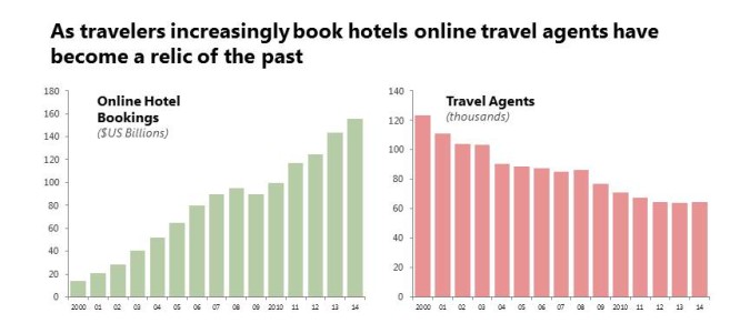
With bar graphs, use a soft color for the bars. When you use a dark color, it looks like zebra stripes and creates a moire effect, which is uncomfortable on the eyes. I’m also going to use a positive color for the growth of the online hotel booking revenues and a more negative color for the decline of the travel agents population.
6. Pictures
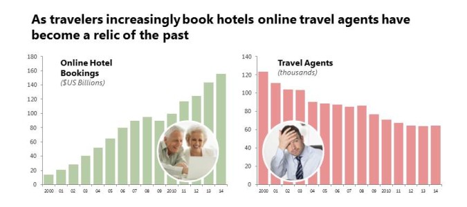
No matter how hard you try, graphs will lack a lot of emotional impact. That’s because they are abstract, and appealing to people emotionally requires something more concrete. Pictures is the missing ingredient.
In particular, pictures of people give you the most emotional impact. And whenever I create a graph I want to ask myself “Are we talking about people right now?” Because if we’re talking about people, and the impact on people, I want to add pictures of those people.
In this case, we’re talking about the decline of travel agents (people!). We’re also talking about rising online hotel bookings. But hotel bookings don’t rise by themselves. They rise because someone is doing something (more people!). So I’m going to reflect that through pictures.
7. Contrast
One last thing. Storytelling is about contrast. Good versus evil. Life versus death. Loneliness versus love. So if there’s contrast in the story we’re telling, we want to emphasize that. We’ve done that through the use of color (positive green versus negative red) and choice of pictures (happy older couple versus unhappy younger male). I’m going to punctuate that point with arrows (up versus down).
One blog visitor, Sheila B Robinson, pointed out in the comments section another reason for the arrows: some audience members are color-blind and cannot see certain shades of green and red. The arrows are another cue.
Another blog visitor, Andy Cotgreave who helps run #MakeoverMonday, also posted a helpful comment that the arrows I originally used are too large (see original here). I agree. I like adding annotations to graphs, like arrows, because they quickly summarize data. But the rule is to make them only as large as they need to be, and no more. And I agree the original arrows were like throwing one too many persons into the lifeboat, so here’s my revised final with smaller arrows. (I’ve also used one of my favorite techniques for titles: using ellipses to join two different graph titles into a coherent story.)
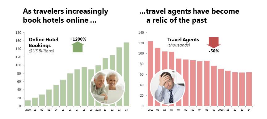
Storytelling with graphs is not about accurately visualizing the data. It’s about determining the story in the graphs and then intelligently using design principles to bring that story into our minds and straight through to our hearts. If you want all my techniques for creating clearer, more engaging and more persuasive graphs, look for my new book “Storytelling with Graphs” which I’m hoping to release this year.
About the author: Bruce Gabrielle is author of Speaking PowerPoint: the New Language of Business, showing a 12-step method for creating clearer and more persuasive PowerPoint slides for boardroom presentations. Subscribe to this blog or join my LinkedIn group to get new posts sent to your inbox.

6 Comments
I’ve been reading with great interest all the blogs about this particular makeover, but I must say that yours is my favorite! I love the side-by-side bar graphs, along with the addition of the pictures and large arrows. If I can offer one suggestion, it would be to choose different colors. I prefer the green and red and “positive” and “negative” connotations myself, but someone with a particular type of color blindness would likely have difficult with this. Still, the directionality of the bars and arrows keep this version interpretable even without the use of color. Thanks for sharing your process!
Hi Sheila – Thanks for your kind comments. You are right that color is problematic when you’re dealing with color blindness. It’s hard to find colors that work for everyone. That’s another reason the arrows are important. It’s a helpful observation and I’ve added it to the blog post.
Well-done. But not accurately titled as its turned out delightfully much more than a ‘crossing lines makeover’. Instead it’s an informative overview of creating persuasive graphs.
Hi Nathan – Thanks for that comment. You are right. Storytelling with graphs is more than visualizing data. It’s finding the story in the data and then making it come to life so it goes into the audience’s brain and through to their hearts. That’s where we need to go next with graphing.
Wow! This is excellent. I agree with Sheila B – this is the best blog about this week’s Makeover.
Your progression through the changes is extremely well thought out. I agree with each point, but do wonder whether the addition of the picture *and* the big arrow ends up leading to too much clutter. By the time we’ve added everything things aren’t so clean as they were when it was just the bars. I think I’d be happier with the picture OR the big arrows, but not both.
But even despite that small niggle, I appreciate this post and thanks for taking so much time to think about and explain the process.
Hi Andy – Thanks for the kind comments about the blog, and for running this fun weekly challenge.
I’m glad you mentioned the arrows. I too felt they were too large and had a sense of dissatisfaction with the final product. Really, the arrows should only be as large as needed AND NO MORE. I’ve updated the final graph to reduce the arrow sizes. Thanks for your helpful prompt. (You can see the original here.)
Hope you’ll visit the blog again. And I’ll look forward to future #MakeoverMonday challenges!