The Secrets of Storytelling in the Boardroom, Part 6 – 4 Ways to Structure Your Preso as a Story
May 8, 2011Which Slides Can You Swap for a S.T.A.R. Moment?
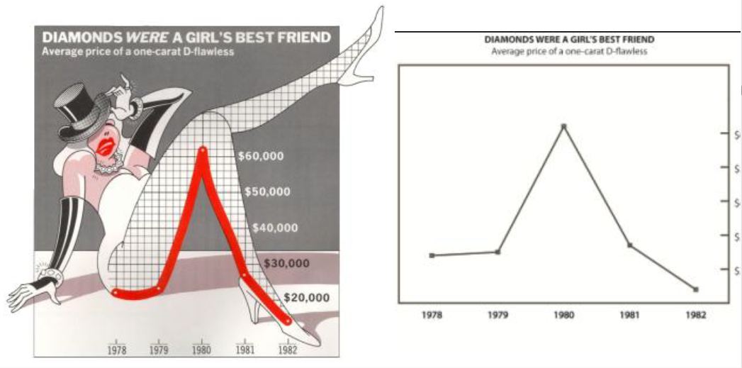
May 10, 2011Among graph-makers, a debate rages. One camps say remove all “non-essential” items from graphs, including gridlines, tick marks and even color inside the bars – what Edward Tufte calls chartjunk — because it conveys no useful information and inteferes with readability.
In another camp are artists like Nigel Holmes, who creates cartoon-graphs for USA Today (what Edward Tufte calls chartoons). Their argument is non-essential items increase interest and convey meaning.
Which graph do you think is clearer? More convincing? More memorable?
Researchers at the University of Saskatchewan tested both charts to see which one is (1) easier to understand and (2) easier to remember, in the 2010 study Useful Junk? The Effects of Visual Embellishment on Comprehension and Memorability of Charts.
Twenty students viewed charts like these, while researchers asked them to describe and interpret the charts. Students were prompted for more detail and scored based on how much they got correct. A few weeks later, they were asked which charts they remembered.
The results?
- Students could understand both equally well when describing the chart’s topic, x- and y-axes and the data values
- Students liked the embellished charts more
- Students understood the main message from the embellished charts more
- 2-3 weeks later, students remembered the embellished charts more
Now, before you rush out and add pictures of dancing girls to your quarterly sales report, remember these results are ONLY valid in situations similar to the study conditions:
- Simple charts and a disinterested audience
- When the image reinforces a simple message
- When the goal is immediate liking and long-term retention
- Compared to butt-ugly black and white charts
1. Simple charts and a disinterested audience
In this study, the charts contained just 5 data points and were not relevant to the students. For instance, a 19-year old student in 2010 would not care about a graph showing diamond prices from 1978-1982.
If you’re presenting simple graphs with data that is largely irrelevant to the audience, then adding embellishments will make it more interesting. This may describe a USA Today reader but may not describe a business executive, scientist or academic. Future research should use more complex data sets the participants want to study closely.
2. When the image reinforces a simple message
Audiences “got” the message more when the graph was embellished with an image. But since the image was purposefully chosen by the author for its metaphorical and emotional value, what other outcome would you expect?
So if your message is simple, and you can find a professional-quality image that reinforces the key message, then use it. But if you’re creating a complex graph with several different implications, or if your audience wants to study the data and come to their own conclusions, a metaphorical picture may be an unwelcome distraction.
3. When the goal is immediate liking and long-term retention
Over the past 40 years, research has proven pictures are more interesting and easier to remember than graphs, especially if the audience is disinterested. That’s why advertisers so commonly use pictures in their ads, and not graphs.
So, yes, consider embellishing graphs with imagery if you want to affect people emotionally. But be careful. Adding cartoons to your business graphs may create more contempt than liking, and any long-term memories the audience holds may not be flattering. Future research should measure how each graph affects the presenter’s credibility.
4. Compared to butt-ugly black and white charts
One of the greatest weaknesses of this study was comparing the embellished charts to charts that you rarely encounter in the real world – stripped to the bare metal and without color. Did you even need a study to convince you to add some color to your graphs? Perhaps color charts that are elegantly designed would be just as likeable and memorable, or more so, than embellished charts. Future research should include this as an option.
There have been some critics (Stephen Few, Kaiser Fung) who question the study’s methodology. But really, it’s irrelevant whether the sample size was large enough, whether there were selection biases or whether the researchers documented their methodology sufficiently. The results are exactly what you would expect when you understand how limited are its practical applications:
- For simple graphs
- And a disinterested audience
- Add a metaphorical image that reinforces your key message
- To increase immediate understanding of your key message
- And increase liking
- And increase long-term retention
- Without harming understanding
- Instead of using a butt-ugly black and white chart
Did you really need research to believe this? In fact, the greatest failing of this study may be that it said nothing new at all.
About the author: Bruce Gabrielle is author of Speaking PowerPoint: the new language of business, showing a 12-step method for creating clearer and more persuasive PowerPoint slides for boardroom presentations. Subscribe to this blog or join my LinkedIn group to get new posts sent to your inbox.


0 Comments
[…] @Speaking PowerPoint – Does chartjunk really trash your graphs? 4 discoveries from research Esta entrada foi publicada em Imagem com as tags Nigel Holmes. ligação permanente. ← 40 infografias úteis e criativas GostoBe the first to like this post. […]