The #1 Best Advice for Choosing PowerPoint Fonts
December 5, 2011WOW! Top 9 Tricks to Get Retweeted (Please RT!)
December 19, 2011The measure of a chart is how quickly it conveys the message while being visually pleasing. Conveying the message is, of course, the main point of the chart. Visually pleasing is also important because it enhances your credibility.
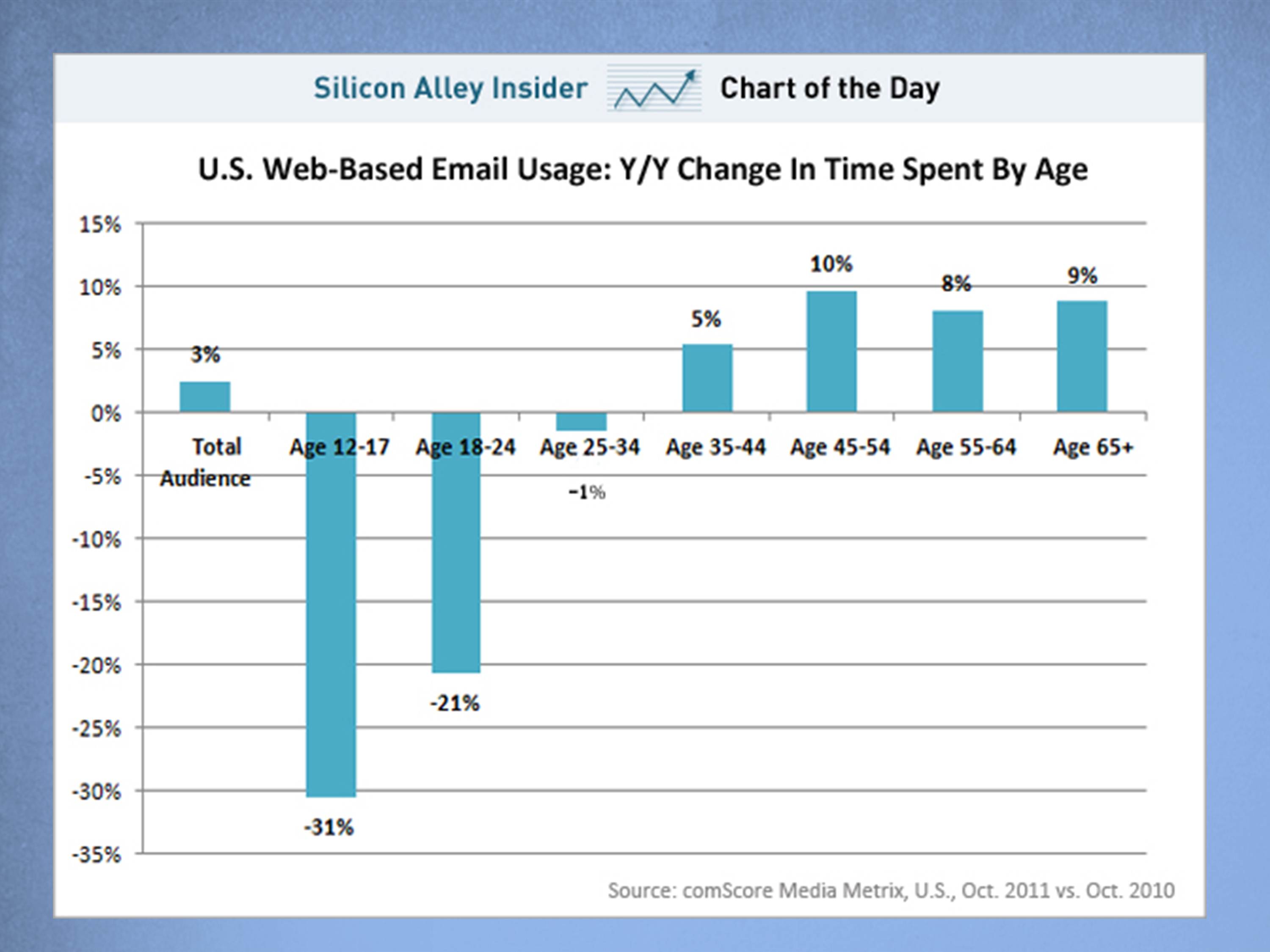
Here’s the Chart of the Day from Silicon Alley Insider. As an educational exercise, let’s critique this chart.
I would give this chart high marks. The message is clear: there’s a clear difference in increasing/decreasing email usage between age groups. To facilitate the message, this data is laid out in an up/down orientation, which is exactly right for communicating rising/falling forces. So the graph visually communicates the message. Ease of reading is assisted by adding the data values to the bars and by keeping the axis titles close to the bars. Overall, this is easy to visually digest, inspect with a few quick eye sweeps and understand.
The graph is also visually pleasing, with a cheerful blue for the bars and relatively subdued gray-blue for the horizontal rules. There isn’t a lot that could be improved.
In the interests of helping you build your graphing muscles, here is how I’d approach this graph.
1. Graph title. First, I’d write the graph title so the main message is clear. This is for the audience’s benefit, but it’s also for my benefit. If I don’t know what I’m trying to say, then my graph is doomed to failure. So write out your graph’s main point as a full sentence.
2. Color. Second, I’d color-code the negative values red. This has three benefits: it groups the graph into two distinct visual groups, it conveys negativity, and it attracts the eye to look at the negative values instantly.
3. Spacing. Third, I’d adjust the spacing between the bars to 50%. This brings the bars closer together and the eye doesn’t have to make a “running leap’ to go from bar to bar.
4. Remove “mumblers”. Finally, I’d remove the “mumblers” (the unnecessary details that clutter the graph).
- Remove the repetitive word “Age” on the axis labels. We do use the words “Age” in the first and last bars but that’s all we need to clarify we’re talking age groups
- I normally also suggest removing the y-axis completely if you’re putting the values directly on the bars. But in this case, I’d keep it. The negative/positive value may be confusing to the reader at first, so the y-axis helps them to become oriented quickly.
- Remove the horizontal rules completely, which add unnecessary ink to the graph and occassionally bump into the data labels. Alternately, you could keep the rules but soften them to a light gray or a dotted line, so they’re whispering in the background.
Even though I normally remove the horizontal rules, I kind of like the second graph with the horizontal rules. The lines act like highway markers and as you pass each one you’re reminded how long that particular bar is. But really, any three of these graphs would be easy to understand and visually pleasing.
And that’s part of the fun, isn’t it? The personal satisfaction of building something that’s beautiful to you. Which is your favorite?
About the author: Bruce Gabrielle is author of Speaking PowerPoint: the New Language of Business, showing a 12-step method for creating clearer and more persuasive PowerPoint slides for boardroom presentations. Subscribe to this blog or join my LinkedIn group to get new posts sent to your inbox.


0 Comments
Another great tutorial Gabrielle. I love the challenge of refining and distilling data illustration like this.
The summary statement (the message) at the top of the chart fulfils the role of answering the Why? question for the audience straight away – Why are you presenting this slide to me? Rather than them having to try and work out what the message is or waiting for you to eventually get to it, they get to see it straight away and then move straight onto their next question… How do you support that statement?… and this is where the clear data kicks in.
It’s all about clarity and speed.
Well said Jon. I like your audience-first approach. What does the audience need in order to understand this quickly is right on.
This is highly evaluative article posted. It gives good useful information.