Data Viz – How Close Are We to a Budget Deal?
October 14, 2013The Greatest Storyteller of all Time
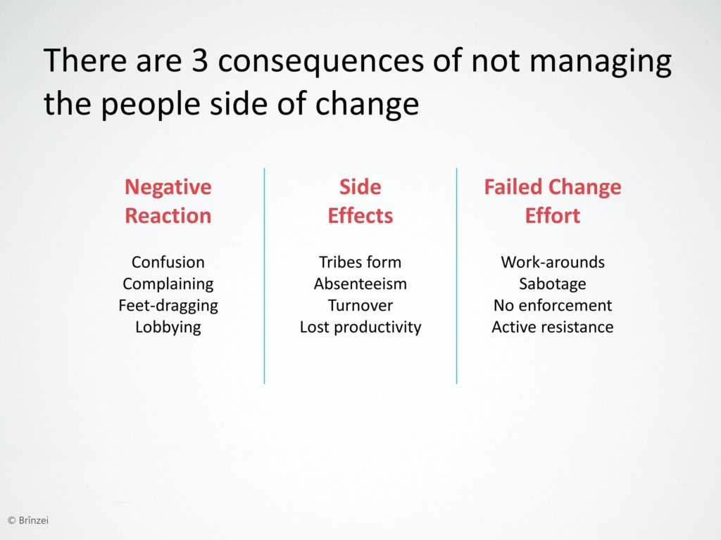
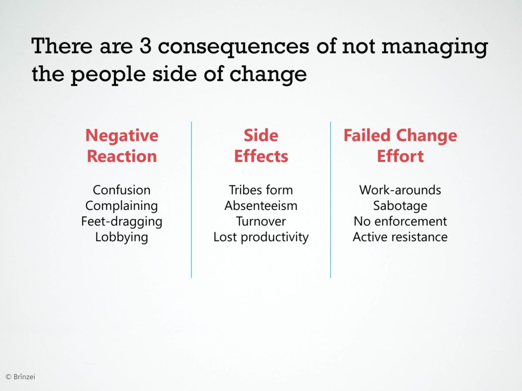
November 28, 2013I’ve heard a lot of advice on how to make your slides look more professional. But one of the best pieces of advice is this: try to make your PowerPoint slides not look like PowerPoint slides.
One of the easiest ways to do this is to choose a different font. By default, PowerPoint will offer you Calibri. And by default, your slides will look like every other PowerPoint slide. Yaawn.
But you can make a better impression on clients, colleagues and students if you’ll choose a different font. I like to use Rockwell for the titles and Segoe UI for the body. You can change the font in the slide master.
Oh, by the way. You may be wondering about that lovely slide background. What is that? It’s simply this photograph on Flickr, shared via a Creative Commons License from the photographer Brinzei. I had to adjust the transparency to mute the image a bit, then crop out the trees at the bottom. Changing your background to a textured background is another great tip for making your slides not look like PowerPoint. I’ve created this video showing you how to make textured backgrounds.
About the author: Bruce Gabrielle is author of Speaking PowerPoint: the New Language of Business, showing a 12-step method for creating clearer and more persuasive PowerPoint slides for boardroom presentations. Subscribe to this blog or join my LinkedIn group to get new posts sent to your inbox.


9 Comments
Hi Bruce
Why a cropped photo for the background if you could easily get that same visual effect using powerpoint resident tools?
M.
Hi Miguel – What resident tools will give you a textured background like this?
—
Bruce
To “replicate” this special case, you can insert a shape, fill it with a gradient, copy and paste it as a picture (paste options/as picture), under “format picture/artistic effects” apply the texture of your choice, adjust with any “Picture Corrections” or “Picture Color”…
You can redo all the copy & paste process and apply textures over textures…
Oops… forgot to add this example made before your suggestion: http://tinyurl.com/q697wkw
M.
Very cool. So
1. Create a radial gradient
2. Copy and paste it as a PNG file
3. Use Format > Artistic Effects to add a texture
4. Repeat the copy/paste-as-PNG and artistic effects adding textures on top of textures
That’s another useful way to create a textured background.
—
Bruce Gabrielle
Doesn’t even need to be a gradient or specify PNG.
It can be done with anything you create from PP’s “Insert” menu, text included.
Simply copy & paste “your” previously edited or customized shape.
The icon which appears in the right-bottom corner of the placed shape “Paste Options (Ctrl)” will offer two options: “Use Destination Theme (H)” which will keep it as is (well not simply that) or “Picture (U)” which will paste an image.
Then you’re free to process it with any PP resident “Picture Tools”…
M.
I have found lately that I just tell a story using pictures. No words. Participants seem to remember the highlight points a lot easier. Also generates talking points and much more discussion. Many sites for free iphotostock as well as using my iPhone to take specific/relevant pictures for the topic that nay be field related.
That may work for some presentations. But not others.
Hi Bruce,
Thanks for the article.
Quick question – are Rockwell and Segoe UI available as commonly on all computers (- like Times or Arial)? If not, using the same might end up not showing properly on clients’ system.
Thanks and regards,
Amit Kapoor
Segoe UI will work on any computer with Office 2007, 2010, Vista or 7. I don’t believe it works on Mac.
Not sure about Rockwell. You can save your presentation with the fonts embedded so even if they don’t have that font installed, it will still show up as if they did. The instructions for doing this are different for different versions of PowerPoint.