35 Best Books on Presentations
October 9, 2012What’s Wrong With This Infographic?
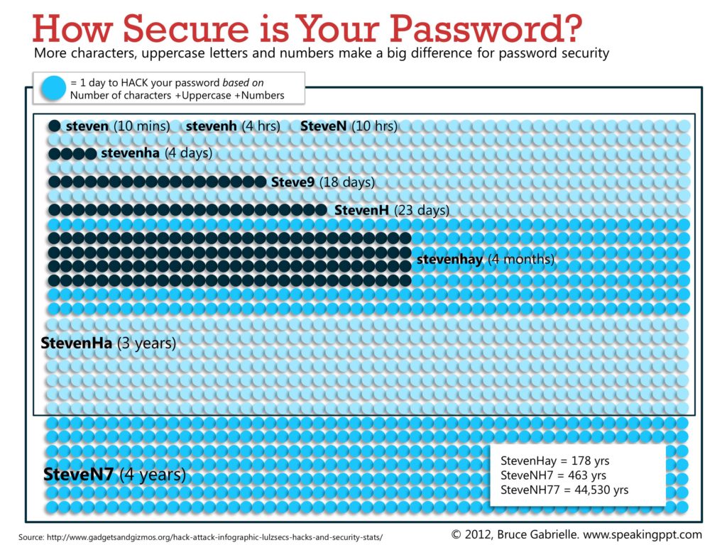
October 18, 2012I love infographics. So I was intrigued when I came across some stats on how combining more lowercase, uppercase and numbers increased your password security, measured in number of days/months/years needed to hack it.
And I created this infographic to visualize the increase in security. See how big a difference it makes?
In case you’re interested, this is known as a unit chart and it’s one of many charts I’ll be sharing in my new book, tentatively titled “Storytelling with Graphs.” Subscribe to this blog to hear when it’s released.
About the author: Bruce Gabrielle is author of Speaking PowerPoint: the New Language of Business, showing a 12-step method for creating clearer and more persuasive PowerPoint slides for boardroom presentations. Subscribe to this blog or join my LinkedIn group to get new posts sent to your inbox.


1 Comment
While the black dots are informative, I find the light and dark blue dot background incredibly distracting.
What are you symbols for years? Say, if you got rid of the background dots, and used dark blue, or bigger black ones for months, then you could make months and years appear easily.