Will Trump Win GOP Primary Race? Graphs Tell the Story.
February 8, 2016Does Trump have Enough Momentum after Super Tuesday? Graphs Tell the Story
March 4, 2016The latest #MakeoverMonday challenges us to visualize this data, showing who is using up all the internet bandwidth. I teach storytelling with graphs in my full-day workshop, and will be releasing a book soon sharing all my secrets for creating clearer and more engaging graphs. As an educational opportunity, I wanted to tackle this data set.
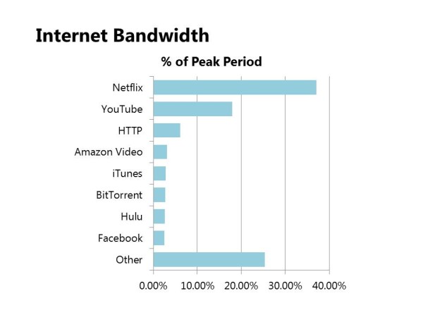
1. What’s the story?
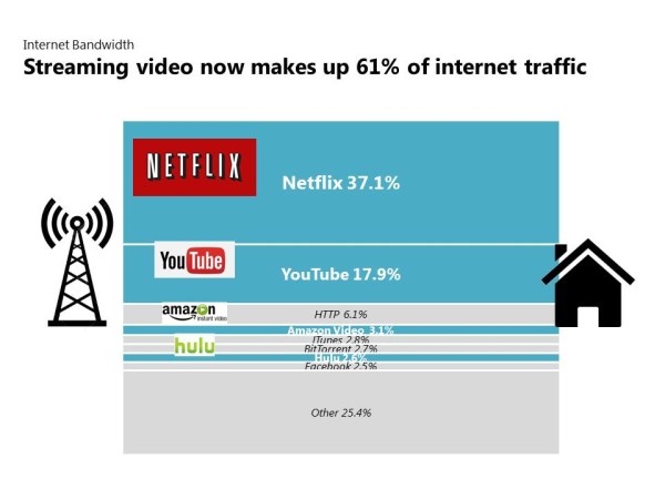
The first step to visualizing data is always going to be: what’s the story? There are actually lots of options here but I’m most interested in the fact that the top two bandwidth hogs are Netflix and YouTube – video streaming services. In fact, we also see Amazon Video Services is #4 and Hulu is #7. So we can summarize the main point as “streaming video makes up 61% of internet traffic”. And we’re going to put that summary in the graph title.
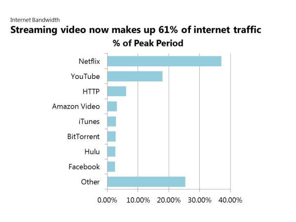
2. What does this look like?
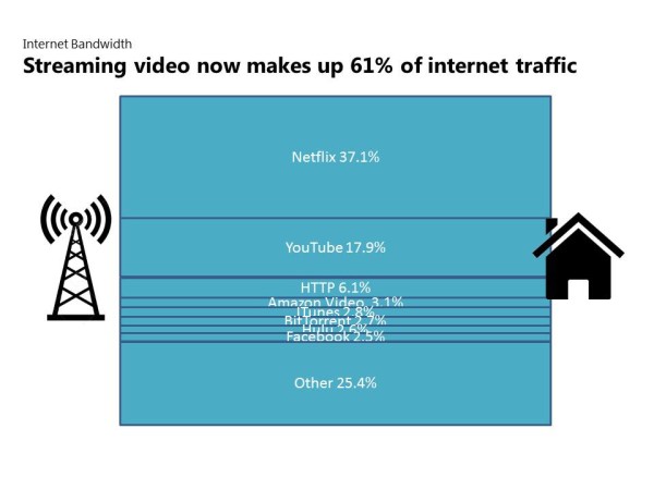
One of the questions I begin asking upfront is “what does this look like in real life?” Because that will suggest the type of graph or table that will bring the data to life. Storytelling with graphs is not about just visualizing data. It’s choosing graphs and other design elements that make the data look more like the real event being measured.
In this case, I’m already visualizing in my head an internet pipe carrying data broken into different lanes. Each lane’s width could represent each data series, showing size by the width of the lane. To finish the look, I’ll add a transmission tower on the left and a house on the right. Now we’ve peeled the lid off the data and are peering down into the actual thing being measured…internet traffic.
 3. Highlighting
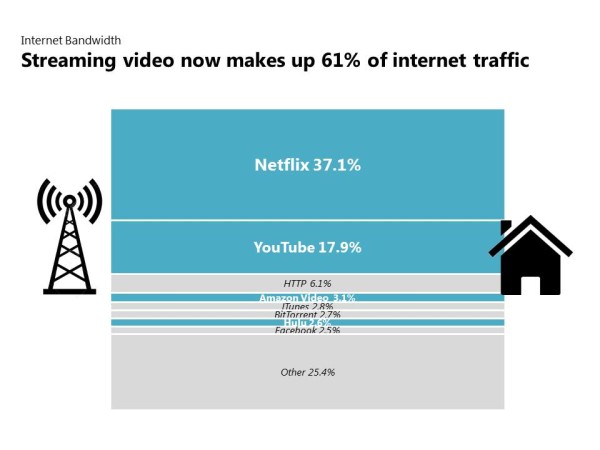
We want to draw attention to certain parts of the graph so we use darker colors for the slices that represent streaming video services. We also use larger and bolder fonts for the largest sections. Everything else stays gray so it whispers in the background. It’s readable, but not calling attention to itself.
 4. Logos
We’re using the icons of the transmission tower and house. But I also want to use the logos for the video streaming services. Logos have emotional impact, especially logos we associate with fun and enjoyment. Many people feel excited when they watch Netflix start up on their TV or computer, and we can harness those emotions by using the logo. Similar feelings might be embedded in the YouTube, Amazon and Hulu logos. The logos also act like signposts, directing the reader’s attention to where we want them to look.
 5. Color
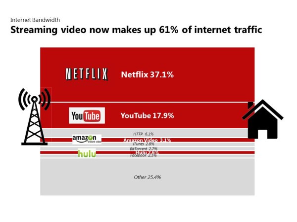
I could use any color for the highlighting. But I’m going to use the exact red you find in the Netflix logo. Fortunately, it also matches the YouTube logo pretty closely. How did I get the exact color match? By using a free software tool called Color Cop.
 6. Motion
Finally, I want to really give the impression of internet traffic flowing left to right, and not just a stacked bar chart. That reinforces the idea of bandwidth traffic. So I create an impression of the shape bending forward. I did this by adding a triangle, filling it in with white and then removing the outline, like this.
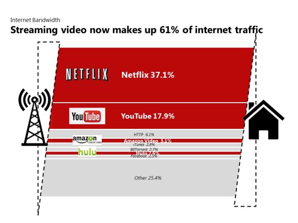 And voila! Here is our finished graph!
 Storytelling with graphs is more than just visualizing data. It’s bringing the data to life in a way that engages the audience and encourages understanding and discussion. Look for my new book “Storytelling with Graphs” which should be released in the next few months. Subscribe to this blog or join my LinkedIn group to get an email when it’s available.
About the author: Bruce Gabrielle is author of Speaking PowerPoint: the New Language of Business, showing a 12-step method for creating clearer and more persuasive PowerPoint slides for boardroom presentations. Subscribe to this blog or join my LinkedIn group to get new posts sent to your inbox.
