Show Percentage vs Goal With the Progress Bar Chart
February 16, 2012Even More Ways to Print White Lines in PowerPoint – PowerPoint Video Tip #14
February 28, 2012Will President Barack Obama get re-elected? History shows Americans prefer to re-elect presidents instead of electing new ones, with 7 of the last 10 presidents winning their re-election bid.
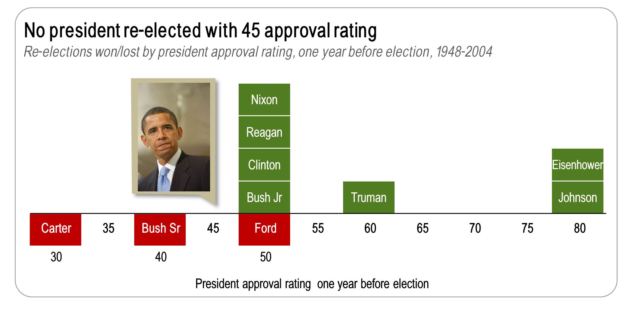
And what about President Obama? The numbers tell a gloomy story for President Obama’s re-election chances. First, Obama had a 45% approval rating in Nov 2011. No president has been re-elected with an approval rating below 50% one year before the re-election.
Second, the unemployment rate was 8.7% in Nov 2011. With only one exception, presidents do not get re-elected when they enter the re-election year with high unemployment rates.
So the story looks grim for President Obama. But these numbers tell the wrong story. Because the real numbers that matter is how things are improving. There is a strong correlation between approval ratings and unemployment rates. High unemployment leads to low president approval ratings. And when unemployment falls, approval ratings climb.
Unemployment has improved over the past year and assuming this trend continues, Obama will head into re-election season with a 1.5% two-year reduction in unemployment, down from 9.8% in Nov 2010 to 8.3% today and still improving.
 There are other factors that matter: the strength (or weakness) of the opposition candidates, the president’s re-election promises, scandals that can derail a re-election bid. But assuming the economy keeps adding jobs, and Obama’s approval rating continues to climb, Americans will likely continue their habit of re-electing the incumbent.
By the way, the graph used in this article is called a win/loss graph and it’s one of many graphs I’ll be talking about in my new book, focused on telling stories with graphs. To get alerted when that book is available, subscribe to this blog or join my LinkedIn group.
About the author: Bruce Gabrielle is author of Speaking PowerPoint: the New Language of Business, showing a 12-step method for creating clearer and more persuasive PowerPoint slides for boardroom presentations. Subscribe to this blog or join my LinkedIn group to get new posts sent to your inbox.


0 Comments
You need to do a chart of a sitting president running against a pack of monkeys.
I love the graph! It’s simple, concise, uncluttered and very attractive!
I feel that if you put Obama’s numbers on the charts it would tell the story from just the chart. I had to go back to the paragraph above to understand the relationship between Obama and the group.