Find the Perfect PowerPoint Font in 5 Steps
June 7, 2011My Presentation is Boring! Now What?
June 9, 2011One important decision when designing slides is “which slide template should I use”? A pleasing template can enhance the look of your slides and create the right mood. A poor template screams amateur.
The main criteria is how interested is the audience in closely examining your slides. The more interested they are, the more you are obliged to show text, graphs and other details. These audiences don’t want meaningless stock imagery or lively rhetoric. They want details. I call these Boardroom-style presentations because they often take place in a company meeting room or executive boardroom. We’ll talk about these in part 2.
However, when the audience is largely disinterested in the details of your argument, or mainly wants to be entertained, you want to keep your slides simple. These audiences will become annoyed by overly-detailed slides. I call these Ballroom-style presentations because they are often performed before large audiences in dimly-lit hotel ballrooms.
The choice of template depends on which type of presentation you’re creating. So let’s start with Ballroom-style presentations.
In a large dimly-lit ballroom, white slides will appear to glare back into the audience like a bare bulb. Instead, color slides with white knockout text look dramatic and will add gravity to your message (think Steve Jobs slides).
Here are four options that should work for all purposes from John McWade’s How to Design Cool Stuff.
1. Dark background. Dark colors like blue and black provide a dramatic canvas for your text and images. Use white or a light-colored knockout text.
2. Dark background with gradient fill. As an alternative to a simple color background, you could add a gradient effect. For instance, a gradient from dark top to lighter bottom gives a “spotlight” effect, like footlights shining up from the bottom of the slide, adding to the dramatic effect.
3. Neutral background. Neutral backgrounds can also be pleasant, and add a lighter mood to the presentation. Knockout white text is more elegant and dramatic but dark text is a bit more utilitarian and invites purposeful reading.
 |
 |
4. Textured background. Finally, you could create your own textured background (see video demonstration), which can create a variety of moods from informal to edgy to powerful to sexy.
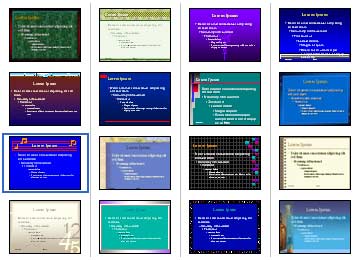
What about templates with background images? John McWade advises against them because, although they look good on a webpage full of PowerPoint templates, once you start adding text and images they appear cluttered.
If you’re a professional designer, you know when you can break these guidelines and use more imagery on your templates. But pleasing design is more about taking elements away rather than adding more elements, so unecessarily detailed slide templates almost self-consciously scream amateur rather than authority. These four options, suggested by design great John McWade, give you a range of safe PowerPoint templates for Ballroom-style presentations.
But white knockout text is challenging to read as slides become more detailed. In part 2 of this series, we discuss templates for Boardroom-style presentations.
About the author: Bruce Gabrielle is author of Speaking PowerPoint: the new language of business, showing a 12-step method for creating clearer and more persuasive PowerPoint slides for boardroom presentations. Subscribe to this blog or join my LinkedIn group to get new posts sent to your inbox.


