Graph Makeover by Andy Arrow
February 15, 2012Obama Re-Elected? Graphs Tell the Story
February 20, 2012On the Microsoft Office LinkedIn group, someone asked this question:
“Which chart is better to show percentage to goal results?”
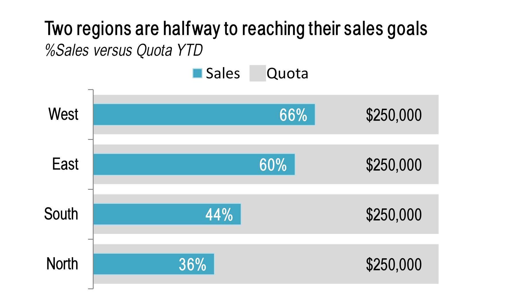
It’s common in business presentations to show progress toward a goal, like percentage of sales versus sales quota or percentage of employees trained versus training goals.
One graph that is great for this is called a progress bar chart. It gets its name because it looks like the progress bar when you’re downloading something from the internet.
How to create a progress bar chart
1. Create a side by side bar chart. One bar shows the goal, the other shows progress to date
2. Overlap the bars with the longer bar in the back. Right click one of the bars and choose Format Data Series > Overlap 100%
3. Color the longer bar a neutral color, like light gray
4. Add a thick border around the longer bar (15 point width in this example). Color it the same color as the bar to make the longer bar fatter and the shorter bar appear to be inside it
5. Add data labels and manually change the dollar values to percentages if you prefer
You may be interested to know I’m writing a followup book to Speaking PowerPoint, focused entirely on how to present and tell better stories using graphs. Subscribe to my blog or my LinkedIn group to be alerted when it’s published, likely in the next few months.
About the author: Bruce Gabrielle is author of Speaking PowerPoint: the New Language of Business, showing a 12-step method for creating clearer and more persuasive PowerPoint slides for boardroom presentations. Subscribe to this blog or join my LinkedIn group to get new posts sent to your inbox.

