3 Steps to Turn a Graph into a Story
April 8, 2013Learn About SketchHatch – A New Online Presentation Planning Tool
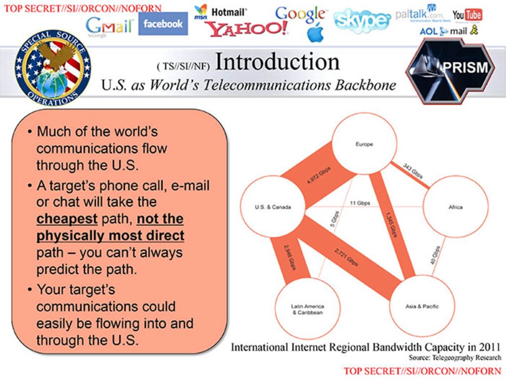
June 24, 2013The National Security Agency is in the news for this horrendous PowerPoint slide explaining the PRISM data-collection program. I wanted to do a slide makeover to show you how to save this slide. And it won’t be hard. This slide will be completely transformed in just SIX STEPS!
1. Visual or Text?
First, this slide is meant to be presented to an audience which means you need to make a choice. Will this be a picture slide? Or a text slide? You can’t have it both ways. Research by Richard Mayer, as well as John Sweller, demonstrate that mixing pictures, extensive text and voice is the least effective way to communicate.
In this case, I’ll choose to make this a picture slide. I will use text just to help guide the audience to key points I’m making on the slide.
2. Concrete or Abstract Picture?
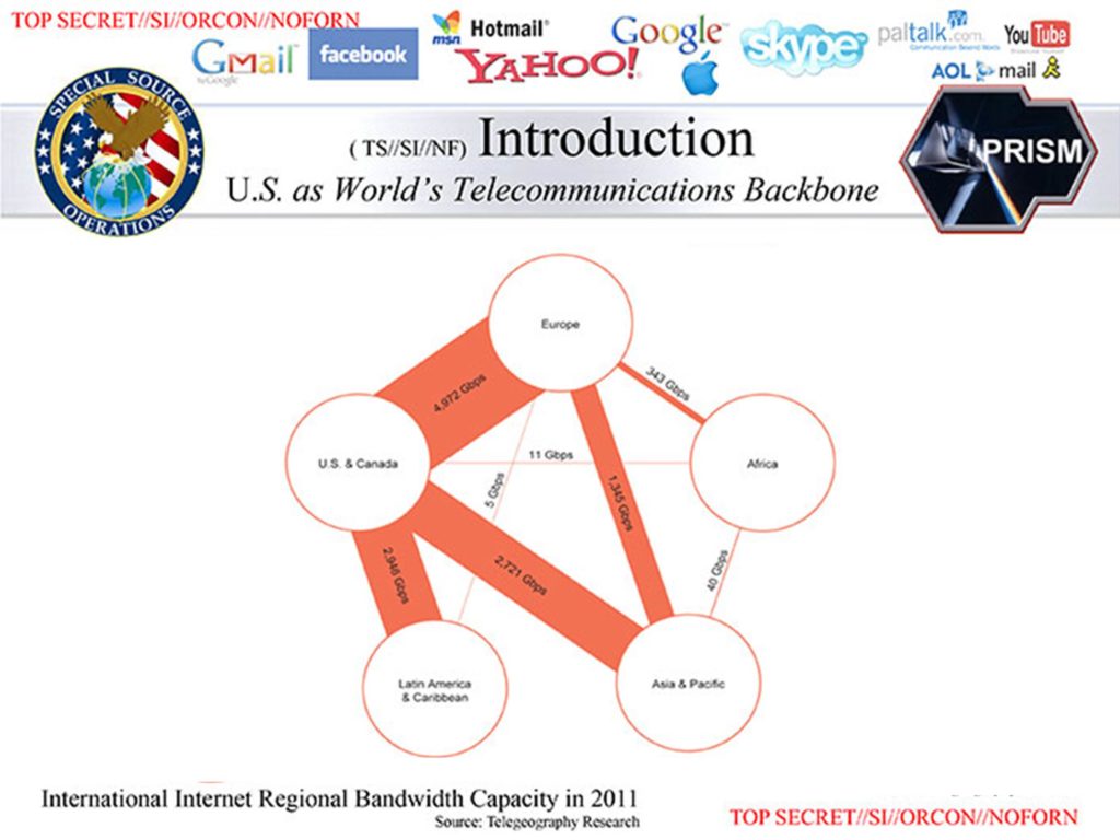
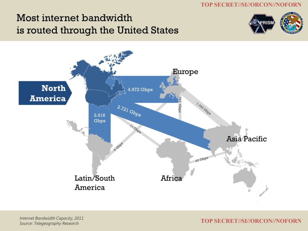
I see we have a Sankey diagram with circles representing countries. The problem is the audience needs to read the text in the circles to recognize the country. That takes time and slows understanding.
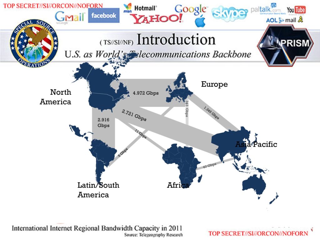
Instead, I’m going to use outlines of countries and try to place them in a physically accurate spatial arrangement. Now the audience can recognize the countries instantly without needing to read the circles. I’m still going to keep the text, so I can direct the audience’s attention to different parts of my slide as I’m presenting to them.
You might think the text labels are unnecessary. Won’t most in the audience be able to recognize Europe versus South America without the text? Probably. However, research finds that when people look at familiar icons, some percentage of them cannot recognize what it stands for, so it’s a best practice to add a text label next to a picture icon. However, it’s a judgment call. You could probably do away with the text labels completely and reduce clutter even further.
3. Highlight what’s important
It’s not immediately clear where the audience should look on the Sankey diagram. And because of that, the diagram seems more cluttered than it actually is.
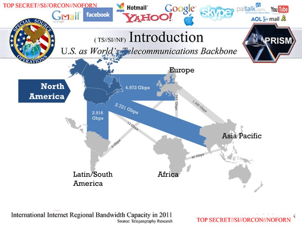
Instead, I’m going to use darker colors to highlight the areas I want the audience to look at. Everything else will be colored gray so it recedes into the background. Now it’s easier to spot North America as the focus of this slide.
4. Slide title
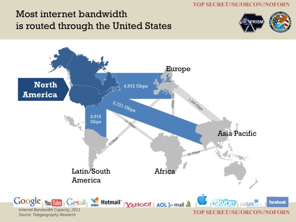
I want the slide title to be informative and so I’m going to summarize the main point of this slide in the slide title. In addition, there’s a lot of clutter in the title area: logos for internet companies, logos for government agencies. I’m going to reduce the clutter by removing the internet company logos completely (for now) and move the government agency logos to the right.
It still looks pretty cluttered, so I’m going to use color borders for the title and footer, which gives me a clear white space for the slide content.
5. Logos
The slide creator obviously wanted to keep these company logos, perhaps to reassure the audience they have the biggest companies working with them. But they add a lot of clutter without adding a lot of information! We can reduce the size and put them at the bottom of the slide, but it’s still a lot of clutter.
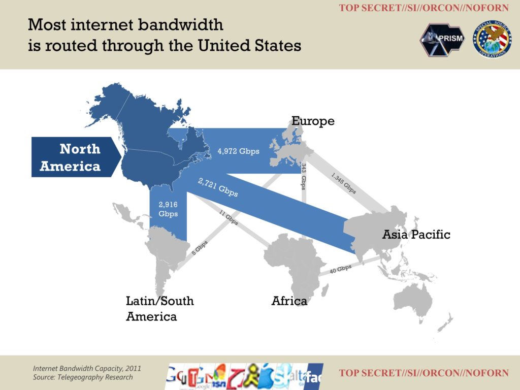
One technique I learned from John McWade at Before & After Magazine is this: each of these logos is recognizable. Even if you only showed a sliver of the logo, you would recognize it. So what if we reduced these 10 logos to slivers and placed them at the bottom of the slide? I’m not 100% sold on this approach, but I think it’s better than having all the logos floating around taking up slide space.
6. Explanatory text
The slide is looking better. But what about all that explanatory text that was on the original slide?
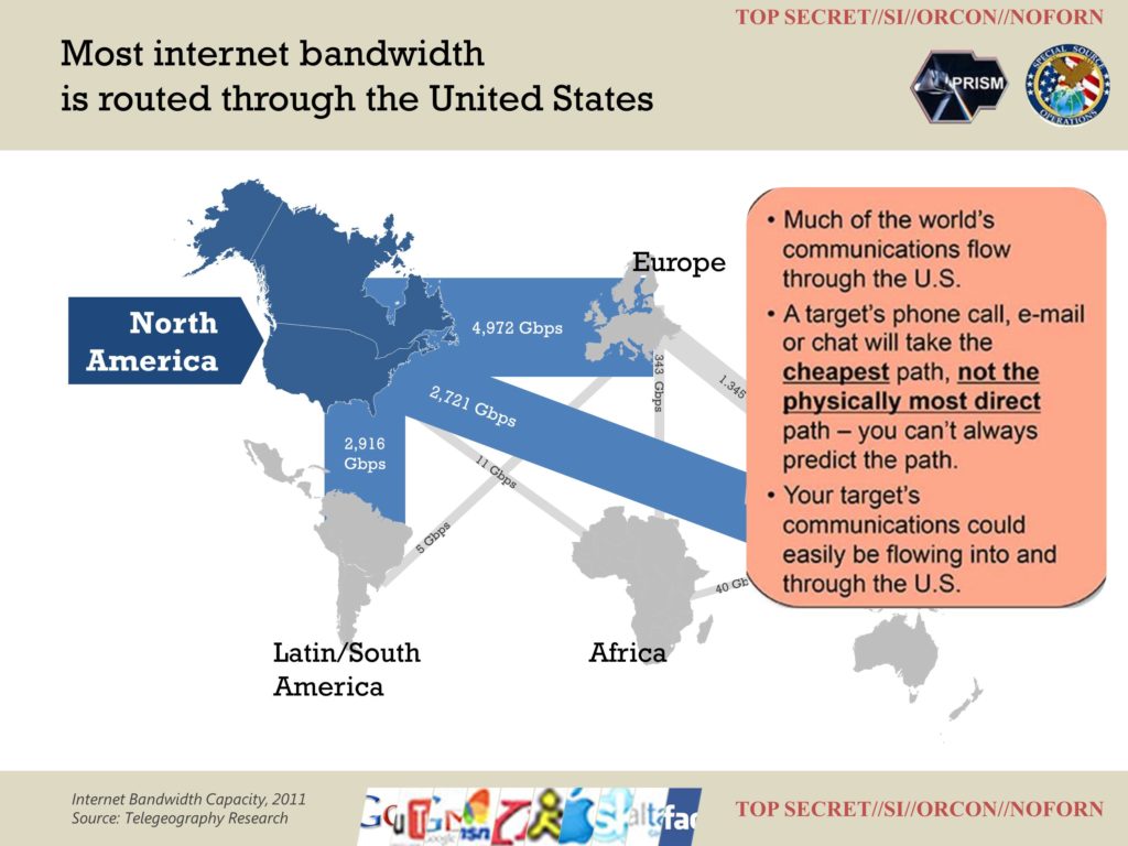
We don’t want to add it back because it creates a slide with text and pictures, a sure audience killer. One option is to delete the bullet points and the speaker just covers this as talking points. But there are two potential problems remaining.
One, some of this content looks really important! For instance, I didn’t know phone calls are routed along the cheapest routes, rather than the most physically direct routes. It seems we need to highlight that point on the diagram, without capsizing the rest of the content. We can do that by adding a dotted line showing an example route between South America and Africa, showing it being routed through the United States. We add the key phrase “Cheapest Path” because we’ll cover that point next, speaking the phrase “cheapest path” as we introduce the topic. We also place it BELOW North America, so the eye goes there second.
The second issue is this slide deck may be sent around later and be read without a presenter. Generally, I advise against this. It’s difficult to create a self-explanatory slide that can be presented. But it’s also an unfortunate reality of our busy business world. In that case, add explanatory text in very small gray type. Now the audience will not be tempted to read it as you’re presenting, but it will be readable when you email the deck around later.
Look at the starting slide again, then the finished slide. Big difference, right? You can see how using just a few simple principles leads to clearer PowerPoint slides. Ugly slides aren’t PowerPoint’s fault. They are the slide creator’s fault. And now you know how to fix them.
About the author: Bruce Gabrielle is author of Speaking PowerPoint: the New Language of Business, showing a 12-step method for creating clearer and more persuasive PowerPoint slides for boardroom presentations. Subscribe to this blog or join my LinkedIn group to get new posts sent to your inbox.



8 Comments
Nice job Bruce 🙂
Much appreciated Jon!
Bruce
Awesome post Bruce! Posts like this are why I’m happy I subscribe to this blog. Love the step by step breakdown.
David – Thanks for your kind comments. Glad the post was useful.
Bruce
Well done, Bruce! Love this post. How did you get the outlines of the continents?
Thanks Donna. They are vector images from http://www.webresourcesdepot.com/all-free-vector-world-maps-ai-eps-svg/
Just ungroup the world map and select the countries individually.
Thanks, Bruce. Looks like other people in our field were just as appalled by the same deck. Check this out:
http://fr.slideshare.net/EmilandDC/dear-nsa-let-me-take-care-ou?goback=%2Egde_119311_member_248757140
You did a better job with the bandwidth slide, but his changes are good.
Great find Donna! I wish I had this person’s mad design skills. 🙂