Dataviz – How will a 20% import tax affect the U.S. and Mexico?
January 27, 2017Will the GOP tax plan be good for you? Graphs tell the story.
December 18, 2017The folks over at Storytelling with Data recently asked about stacked bar charts and they did a graph makeover. I’d like to tackle that same graph from the perspective of storytelling with graphs.
Now there’s a difference between data visualization and storytelling with graphs. Data visualization basically converts your data into a visual. Storytelling with graphs takes it a step further and draws some conclusion from the data, chooses the right graph to make that story clear and uses design principles to bring attention to that story.
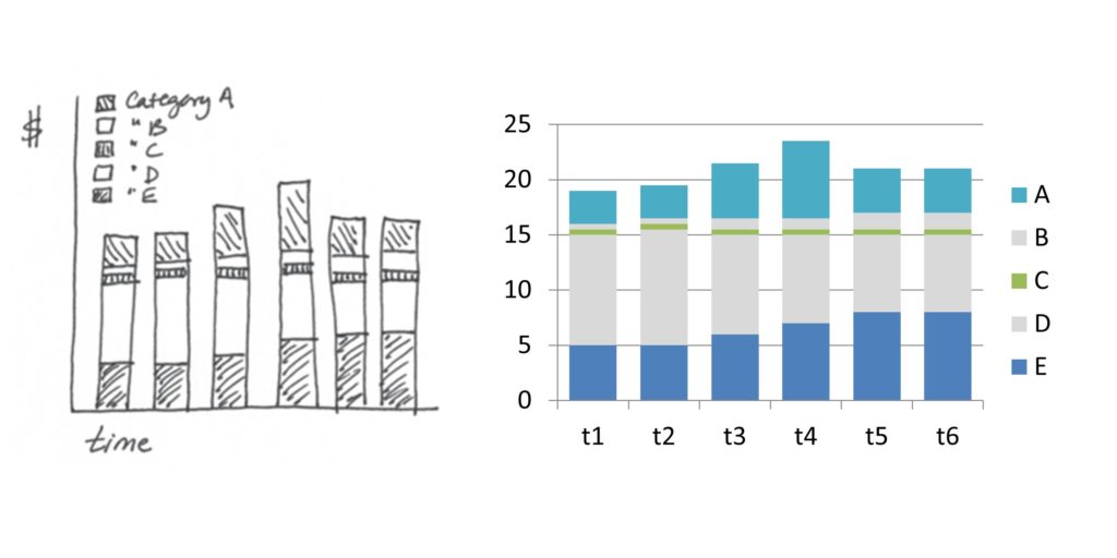
Here’s the original hand-drawn data, and my best estimate to replicate it in Excel.
 // Common Baseline
The secret to presenting data on stacked bar charts is to arrange the bars correctly, so you are comparing data along a common baseline. That typically means moving the most important data to the bottom of the stack, so you can accurately see small differences in the height.
For example, in this graph, you can see that “E” is increasing but has leveled off in t5-t6. You can especially see there has been a very slight increase in t6. You can also see that “D” has been declining. But the differences are less obvious because there is no common baseline. In t6, for instance, we can’t see if there was a slight increase or a slight decrease. So some of these smaller differences are harder to see.
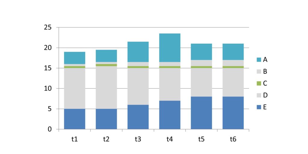 Product “C” appears to be about flat. Product “B” appears to be growing. And Product “A” has had a sales spike in t3-t4 and sales are now receding toward pre-promotion levels. But all of these products have no common baseline and so there’s no way to accurately see small changes.
// The Story
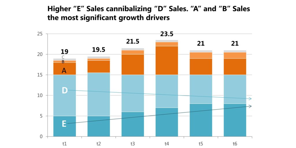
I never design a graph until I know the story I’m trying to tell. At this point, the story appears to be “Product “E” is increasing and product “D” is decreasing, while overall sales are up”.
But notice something. The sum of Product “D” + Product “E” together are about the same across every time period. That suggests that sales of Product “E” are cutting into, or cannibalizing, sales of Product “D”. In other words, Product “E” is not growing the business, but simply shifting customers to a new product.
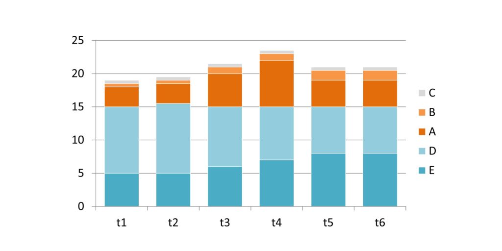
Where is the growth coming from? Product “B” and Product “A”. So I’m going to put those products as the next items in the stack.
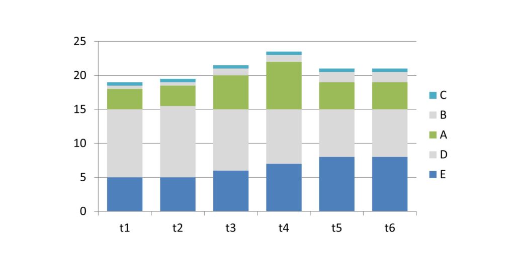 I think of stacked bar charts like shelves on a bookcase. I want to stack my data so the important data is sitting on a shelf. For instance, I can see that Product “D” + Product “E” is basically stable. So if I stack those two products at the bottom, I will create a flat “shelf” to stack my next group. I’ll put Product “A” here.
Notice Product “C” is relatively flat so I could have left it at its current position. But it’s not an important part of this story so I’m going to tuck it at the top of the graph. Product “B” is growing and it would destroy this flat shelf on top of Products “D” and “E”. So Product “B” will also go above Product “A”.
// Color
Now I’ve got the bars stacked in the right order and now I can complete the story: “Product E sales are cannibalizing Product D, with most of the growth coming from Product A”. I typically start by using color.
Product “D” and “E” is one story and I’m going to signal that by using different shades of the same color blue. Product “A” is the second half of this story and I’m going to draw attention to that in a different color: orange. In fact, now I see that Product “B” is as much a growth driver as Product “A” so I’m also going to color code Product “B” orange.
I’m going to color code Product “C” gray. Graphs are complicated enough without having a lot of unnecessary color fighting for attention. In storytelling with graphs, gray is your friend. It allows you to have a lot of extra detail that whispers in the background.
// Finishing the Story
I’ve now found the story and I want to draw attention to that story so it’s quick and intuitive. A few finishing touches:
– I used darker colors where I want the eye to focus (Products “E” and “A”).
– I’m also going to add some arrows showing the directions of growth/decline.
– Make the gridlines a lighter gray – they don’t need to be prominent, just readable
– Make the y- and x-axis fonts smaller and more gray – again, they just need to be readable
– I’m also going to change the axis fonts to Segoe UI. The default is Calibri, but that makes your graph look like everyone else’s graph
– Delete the legend and add it directly onto the graph. No zig-zagging back and forth to read the legend
– Add the totals to the top of the stacked bar chart (add the total as one of the bars, then convert that into a line chart. Make the line color “no color” and add the data values)
The cherry on top is to put the main point in the title. Voila! Now the story is instantly clear using a stacked bar chart.
If you like this graph makeover, you’ll love my new book “Storytelling with Graphs” which shares all my secrets for drawing insights out of data and displaying data to tell a story. Subscribe to this blog to be alerted when it’s available.
About the author: Bruce Gabrielle is author of Speaking PowerPoint: the New Language of Business, showing a 12-step method for creating clearer and more persuasive PowerPoint slides for boardroom presentations. Subscribe to this blog or join my LinkedIn group to get new posts sent to your inbox.

