Strategic Sales Presentations (Jack Malcolm) Book Review
September 25, 2012Romney Wins First Debate. Should Obama Worry?
October 4, 2012I notice a disturbing trend in infographics. Instead of bringing the story to the surface, infographics instead crush the story under a thick gloss of glitzy design, color and iconography. It’s a shame because these artfully designed infographics could be so much more useful with better data visualization skills.
Below are 2 examples, with my comments and makeover.
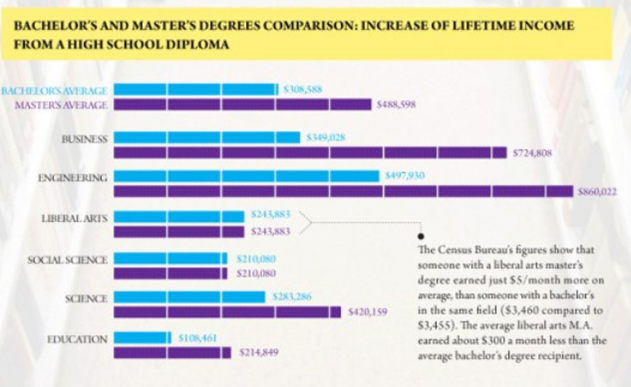
1. Is a Master’s Degree Worth It? (original >>)
This is a great title and so timely given the skyrocketing cost of education. The infographic design is artful, but does it really answer the question it posed?
My comments
1. This infographic doesn’t answer the main question posed. Can you, at a glance, tell if a master’s degree is “worth it”? That’s the point of an infographic – to make the meaning instantly clear, isn’t it?
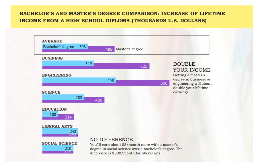
2. The graph highlights the wrong data: the lifetime earnings for a bachelor’s versus master’s degree. But that’s NOT the data we are interested in. We are interested in the DIFFERENCE earned. We can highlight the difference by overlapping the bars to mainly reveal the sliver that makes up the difference.
3. The bars are not sorted in any meaningful way. You could, for instance, sort them from greatest difference at the top to lowest difference at the bottom, showing SOME degrees pay off more handsomely than others.
4. Attention is stretched across the page. The eye has to stretch to read the axis labels way on the left and data labels way on the right. The bars are also unnecessarily long. Packing things together more tightly helps.
5. Data to the exact dollar is too detailed and harms readability. Rounding to the nearest thousand dollars makes this graph more readable.
Here’s the infographic makeover. What do you think?
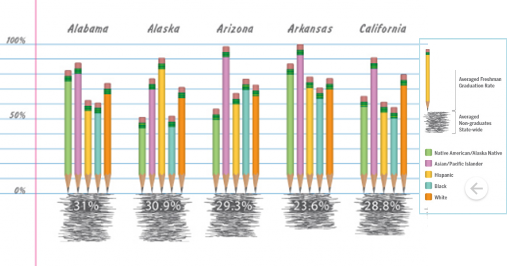
2. A Dropout Epidemic (original >>)
The catchy title promises to show you some startling dropout rates. Here’s a snip of the infographic. What do you think? Are these rates alarming?
My comments
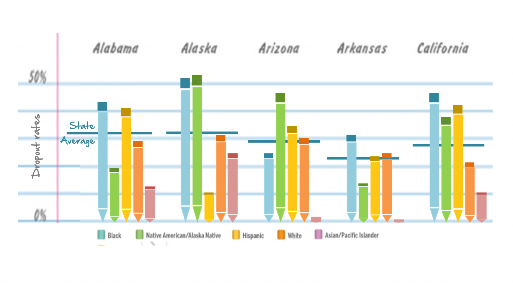
1. This graph shows the wrong data: graduation rates. But we are interested in DROPOUT rates, which you must derive by looking at the whitespace above the bars (pencils). The fix is simple: create bar graphs showing the DROPOUT rate.
2. The bars show ethnic sub-groups in some random order. That destroys any patterns we might see in the data. Instead, they should be ordered to reveal the pattern from groups with the highest dropout rate (Black) to lowest (Asian). Now, for each state, we can see the pattern and even spot differences more easily in each state (eg. low Black dropout rates in Arizona).
3. The average statewide dropout rate is shown at the bottom, as text in a scribble. The scribble size is supposed to indicate the magnitude, but it’s no better than a table since you are so dependent on the written numbers. Instead, just add a reference line to each graph. Now you can easily compare each group against the state average, and even the difference in state averages.
4. The pencils are overly-detailed, which is creative and engages the reader, but it’s distracting. Notice how the dark metal band is the focal point, pulling your eye down from the end of the bar, making you struggle to read the data. I would reduce these to minimally designed pencils – perhaps using a dark eraser tip to attract the eye upward.
5. The data legend is difficult to read placed off to the side. Instead, move the data labels closer to the data and arranged in the same left-to-right sequence as the data.
Here’s the infographic makeover. What do you think?
This is the era of Big Data and telling stories with data. I’d like to see infographic designers take to heart their important mission of revealing the story in their data through their design, rather than just dressing up data without revealing the story. That’s the basis for my next book – tentatively titled “Storytelling With Graphs”. Subscribe to my blog or LinkedIn group to learn when that book is available.
About the author: Bruce Gabrielle is author of Speaking PowerPoint: the New Language of Business, showing a 12-step method for creating clearer and more persuasive PowerPoint slides for boardroom presentations. Subscribe to this blog or join my LinkedIn group to get new posts sent to your inbox.


2 Comments
Bruce, I would also add that each slide should have a headline that summarizes the main point, rather than a title.
Hi Jack – Yes, I agree with you. In fact, if the designer had written out a title, that would have helped them to think through what message they were trying to convey and design the infographic differently. Without that title, it’s easy to just create something pretty but without a clear message.