The #1 Time to Avoid Bullet Points
November 7, 2011How to Print White Lines – PowerPoint Video Tip #13
November 27, 2011I was inspired by this post by the Excel gurus at Chandoo.org to emphasize the importance of smart legends in charts.
What are smart legends? Well, legends do more than label your data. They can also be used to quickly summarize your message.
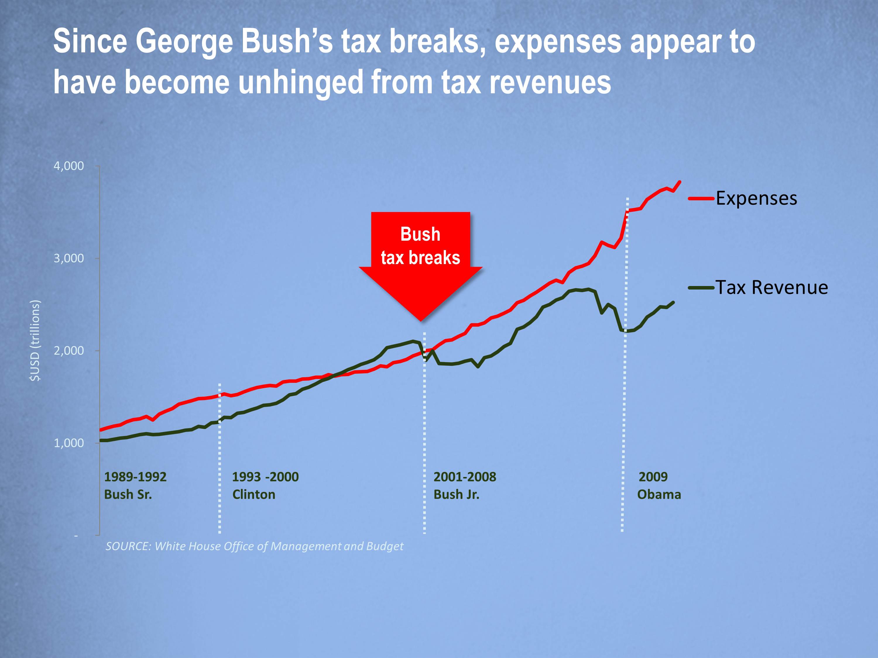
Look at this chart, showing U.S. tax revenues and expenses for the past 20 years, using the Excel default legends.
Not bad. Very clean. But you can do better if you use smart legends to summarize your key points.
Look at this updated chart, demonstrating the use of smart legends.
Smart legends summarize the key points in your data, using text, numbers and symbols. You can be creative in your use of smart legends.
 Want your charts to be legendary? Then use smart legends to emphasize your key message the next time you create a chart.
About the author: Bruce Gabrielle is author of Speaking PowerPoint: the New Language of Business, showing a 12-step method for creating clearer and more persuasive PowerPoint slides for boardroom presentations. Subscribe to this blog or join my LinkedIn group to get new posts sent to your inbox.


0 Comments
This is a fantastic idea. I always put legends close to the lines to improve readibility and avoid taxing the audience’s cognitive capacity. However, adding this verbose legends is really smart 🙂
Great post. I had not heard the term smart legends before…