Conflict or Curiosity: What drives a story forward?
January 20, 2014What If Your Presentation Won’t Fit a Story Structure?
June 24, 2014Facebook’s data visualization contest Viz Cup gives me mixed emotions — excitement about the growing interest in smart data visualization, and sadness about the poor data viz practices among the entrants.
Case in point is last year’s winner, Eric Rynerson, with this entry. Now, to be fair, Eric only had an hour to put this data viz together (he studied the data the night before) and there are a lot of good practices here. But as an educational opportunity for you, dear reader, I want to point out the weaknesses in this data viz and suggest a makeover.
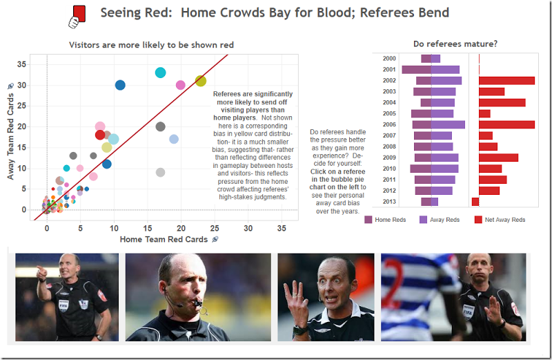
Here’s Eric’s winning entry:
1. Bubble Chart
Let’s start with a critique of the bubble chart in the upper left. What I like about it:
- a. The graph title summarizes the main point, requiring less work for the reader
- b. It’s a good choice for comparing two groups. You can tell from the slope if there is a bias toward penalizing the Away team
- c. The graph is relatively subdued with light gridlines whispering in the background and muted colors for the bubbles
But here’s the things that don’t work
- a. First, the graph title is too small. It’s the same size font as the axes numbers. It should be more prominent
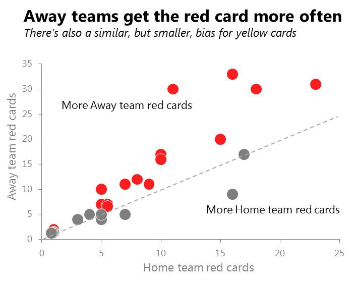
- b. The bubbles are different colors but I don’t know why. Is this so you can distinguish the tiny bubbles clustered in the lower left? Or is it to add variety to the graph? Generally, the reader will assume the colors have meaning. In this case, I’d avoid the randomness of the many colors and use red for the refs that hand out more red cards to Away teams, and gray for refs with no apparent bias
- c. And I’m not going to just use any red. I’m going to use the exact red on a penalty card because those who are familiar with that red have learned a subconscious reaction to that particular shade of red. And I want to generate that reaction
- d. The bubbles are also different sizes. Again, it isn’t clear if this is supposed to mean something or not. If it does, indicate that somewhere on the graph. If not, then keep them all the same size
- e. Eric has added a regression line to the chart. But a better option would be to add a 45-degree line, showing the expected position of refs who penalize Home and Away teams evenly
- f. You should also add text labels to each half of the chart, so readers clearly understand what it means to be above or below that line
- g. The annotation explains there is a similar but weaker bias for yellow cards. But the extensive text clutters the graph unnecessarily. Better to remove that annotation, or minimize the amount of text
So my makeover of the bubble chart would look like this
2. Column Charts
The column charts in the upper right are intended to appear as you click on each bubble. I like a couple of things about these charts
- a. First, I like that we’re seeing some trend data tracking how a referee’s bias may, or may not, change over the years. The basic format of a story is a beginning, middle and end and so a timeline graph gets us closer to a story
- b. Eric shows the absolute number of cards for Home and Away teams, but then he also explicitly calculates those differences and plots them on another chart
- c. The mirrored bar chart is generally a good choice for showing how two data series compare
What I don’t like
- a. The text block to the left of the graphs is supposed to invite the reader to click. But it’s too much text to draw attention. Better would be to use an image with a prominent call to click
- b. Almost always, time series data should go left to right. The reader intuitively understands this. A top to bottom timeline is less intuitive
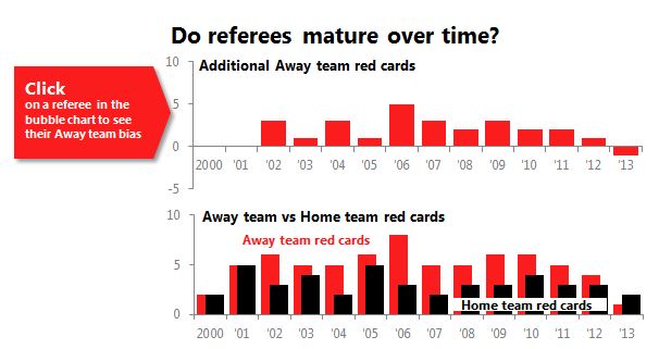
- c. When comparing two data series, and one is clearly larger than the other, I prefer to use an overlapping column chart
- d. The legend at the bottom should be integrated into the graph, where it’s easier to read, and not set outside the graph
- e. The two charts should use a similar scale. Right now, the differences look enormous compared to the absolute values, just because that scale is stretched out
- f. I’m also not a fan of the monochromatic purple for the mirrored bar chart. The purple doesn’t complement the red and seems to be chosen at random. Better to select from our current red color palette and complement it with a strong but otherwise neutral black.
We end up with a graph like this:
3. Layout
Finally, we study the overall layout, including the title, pictures and flow through the piece. I like
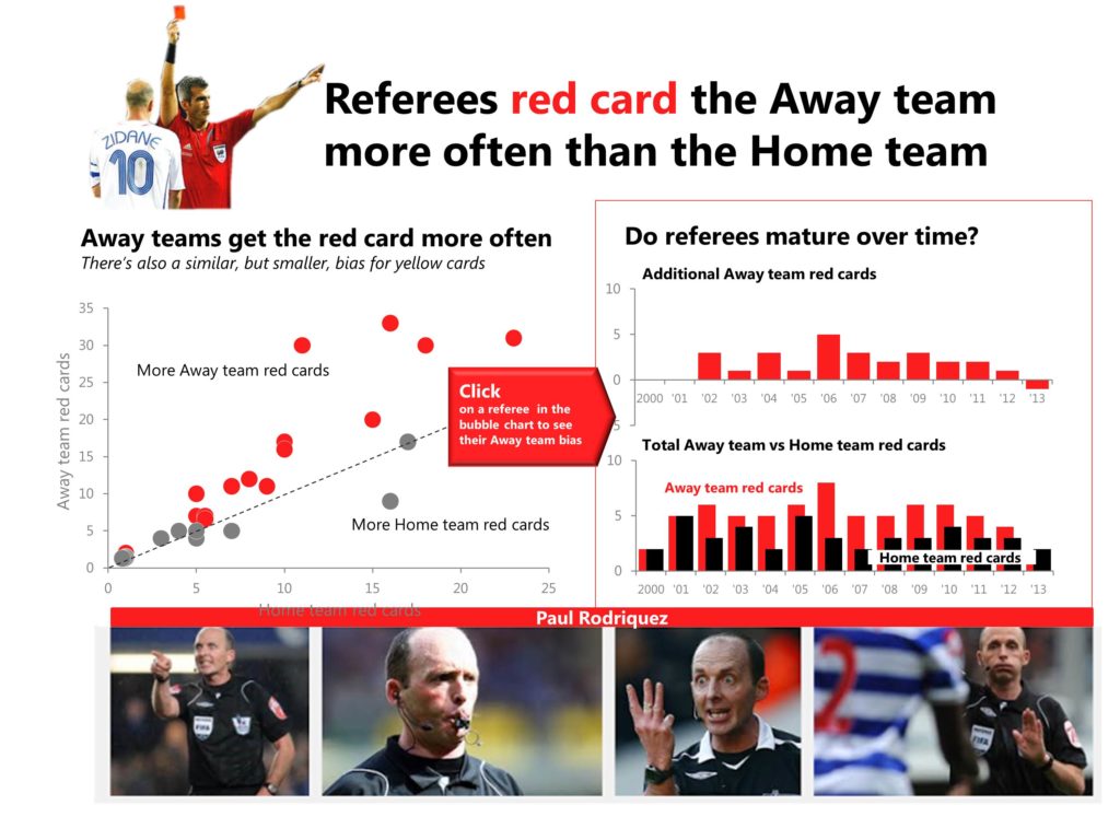
- a. The attempt to add a (clip art) picture next to the title, increasing visual interest and suggesting quickly the topic of the data visualization
- b. The title summarizes the conclusions of the graphs, not leaving that work to the reader
- c. The use of faces is especially effective at drawing the reader into the data visualization and adding some human drama and emotion to what would otherwise be emotionally inert data
What I’d improve
- a. This clip art is weak, has no emotion and generally trivializes the importance of the piece. I’d choose an image with more emotion, like a referee forcefully holding up a red card
- b. The title is a bit vague. I’d write it more directly
- c. The face images below are good, but they are a bit remote from the column charts. In this case, the data in the column charts applies to only one referee — the one in the pictures below. We need to link this more clearly perhaps using a color band
Adding all these elements together gets us a final data visualization that look like this, and tells a better story too, don’t you think? (Hover over the image to compare with the original).

What do you think? Is the story clearer? What other changes would you make? Leave a comment in the comments section. And if you’re interested in knowing when my new book “Storytelling with Graphs” is available, just sign up for my LinkedIn group or subscribe to this blog.
About the author: Bruce Gabrielle is author of Speaking PowerPoint: the New Language of Business, showing a 12-step method for creating clearer and more persuasive PowerPoint slides for boardroom presentations. Subscribe to this blog or join my LinkedIn group to get new posts sent to your inbox.


2 Comments
First off, let me say I love your book. It is the only book I have ever read which provides good information on how to create the types of ppts I work with better. The post is interesting. I agree with the majority of your changes but I would probably add a couple of others:
The “outlier” grey circle on the bottom right of the graph on the left seems to show that the ref has a bias towards handing out red cards to the home team. I would have made that a different color. Otherwise, your definition of red circles (refs with bias towards away teams) and grey circles (refs with no bias) seems suspect.
The top right chart is still confusing to me. What does “mature over time mean” and how does that relate to the headline? I would change the question to “does this bias (of more red cards for away teams) change over time (over something similar but more succinct).
That said, the left chart and bottom right chart both say the say thing – that is that a bias exists. They relate to the overall headline but make me wonder if they are both needed. Additionally, the “mature over time” does not seem to fit. I would either remove it or update the headline to something like “Junior referees show more bias towards the home team.”
The arrow “click” callout seems to be pointing towards the wrong graph. Maybe I’m missing something.
Hi Dan – Thanks for the kind comments about my book and for your thoughtful reaction to the data viz makeover. A few responses
1. I also noticed there were some ‘outlier’ refs in the bubble chart, with a seeming bias toward the home team. I could have used blue to distinguish them, and I think this would have been a fine choice. But I selected to make them gray because I wanted to focus attention on the point of the graph — the majority of refs have a bias against Away teams. But I could have just as easily used blue and added a small footnote that a minority of refs exhibit a Home team bias.
2. The top right charts, as I understand it, relate to a single referee and not all the referees together. That is, when you click on a bubble, those two column charts update. It may be that ‘mature over time’ is too cryptic. Your point is a good one — if possible, show your data viz to others and see if anything is confusing.
3. The column chart and the bubble chart say something different — the bubble chart is a snapshot in time, showing total red cards by referee. The column charts break that total out over time. We’re looking for something different in the column charts — a trend showing the predominance of red cards declines over the years. That trend is not very clear to me. We cannot use a single headline here because it may differ by referee. Instead, the question title is enough.
4. The “click” arrow joins the bubble chart on the left with the two column charts on the right, because the columns will update as you click on a single bubble.
Thanks again Dan for your thoughtful comments.
—
Bruce Gabrielle