Infographic – How Secure is Your Password?
October 15, 2012Graphs Tell the Story of the 2012 US Election
October 29, 2012I spend a lot of time these days studying infographics. Part of the research for my new book “Storytelling with Graphs”.
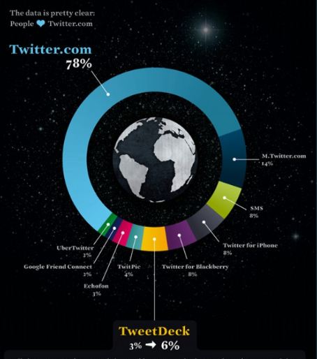
But I keep running across atrocities like this – nice design, terrible understanding of data. Do you see the problem? Study the picture, then scroll down for my analysis.
My comments
1. First, this donut charts adds up to 138%! What does this even mean?
2. The blue Twitter.com donut slice barely makes it halfway around the donut – it’s more like 60%, not 78%. Unfortunately, some reader is going to grab that statistic and share it with others. This mistruth will be picked up as “fact” by people who don’t double-check the source, and repeated on their blogs, Twitter accounts, PowerPoint decks.
3. There are several donut slices that could be color-coded differently to form mini-groups. Especially, the mobile apps could be different shades of green, grouping them into a mobile access sub-group. Then the message gets clearer: Twitter.com is the most common way people send tweets, mobile phones is the second most common.
Designers are ahead of the rest of us in exploring the possibilities in data visualization for a mass audience. But I hope they will continue to educate themselves on data visualization techniques that bring the truth out. Design can be a powerful tool to reveal the truth, or to conceal the truth.
About the author: Bruce Gabrielle is author of Speaking PowerPoint: the New Language of Business, showing a 12-step method for creating clearer and more persuasive PowerPoint slides for boardroom presentations. Subscribe to this blog or join my LinkedIn group to get new posts sent to your inbox.

